An Exploration into the World of Designer Sewing Patterns

Category: Vogue Patterns Magazine

Karl Lagerfeld Pour Chloé.

Karl circa 1975, photograph by Helmut-Newton.

I’ve long been aware of Lagerfeld’s involvement as a designer with the Chloé label, and due to my pattern collecting I had become acquainted with those of his designs that were licensed to Vogue Patterns beginning in 1975. So I recently purchased the book ‘Chloé – Attitudes’ (released October 2013) in the hope of learning more about this period of the label’s history.

Click for a preview of Chloé - Attitudes at Amazon.com.

Click for a preview of Chloé – Attitudes at Amazon.com.

Usually I check out the latest books at two of my favourite book stores for art and fashion books in Sydney (Australia) when I go on a fabric-buying trip for myself to see if any books are worth buying. These trips don’t occur often as I live about four hours drive away from Sydney, but I have to travel that far as it is near impossible to find good fashion and art books and good fabric in rural Australia. I haven’t been to Sydney since early 2013 so I didn’t get a chance to check out ‘Chloé – Attitudes’ before making the purchase online (Occasionally I will buy a book from a bookstore but usually it’s much cheaper to buy online from overseas, and that’s including shipping! The prices of most imports in Australia are notoriously expensive compared to the rest of the world, and that’s with low or no tariffs in the name of free-trade!)

Anyhow, I took a chance and bought the book and was so excited when it arrived in the mail. I think my expectations were a little high as I was disappointed with, what seemed to be, a lack of content. On second and third viewings I came to value the book a little more, but I still feel that there could have been less empty white space and more pictures of the clothes and a little more detail in the text. Still, it would be impossible to cram sixty years of collections into one 273 page book.

The book vaguely captures the spirit of each period of the label’s history, beginning with the creation of the label by founder Gaby Aghion in the early 1950s (approximately 1952-1953) through to Karl Lagerfeld’s twenty year tenure from 1964 to 1984, and then following periods designed by several head designers up to 2013 (including Lagerfeld’s return from 1992 to 1997 which was practically glossed over and paid no attention).

Anyhow, back to Karl.

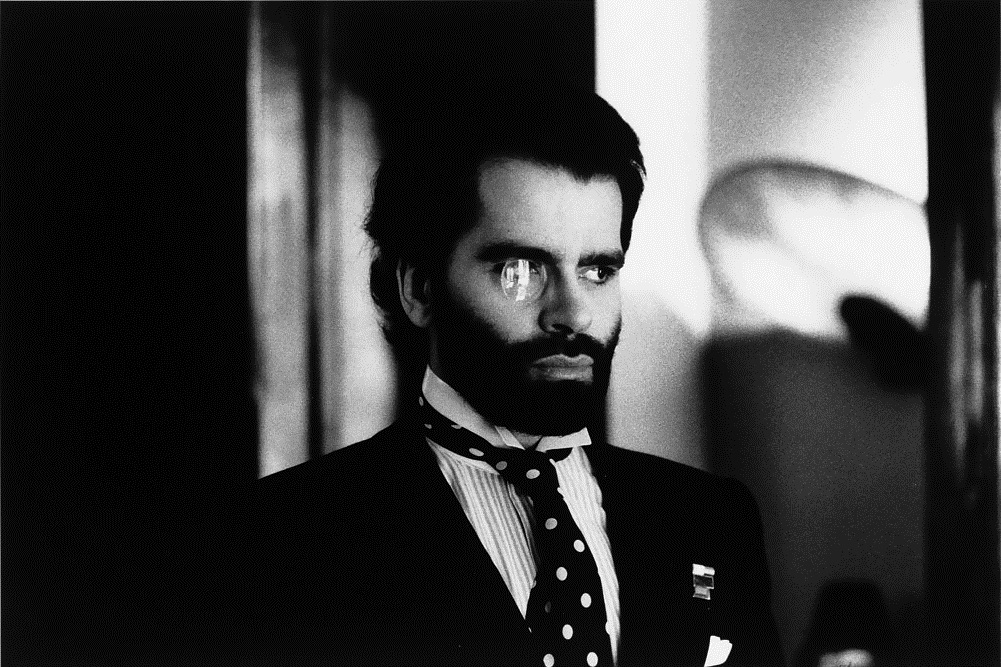
Lagerfeld came to Chloé with couture credentials after previously working with Pierre Balmain and at the house of Patou (see my previous post here) when he was hired as a designer for Chloé.  When he started, he was part of a team of freelance stylistes (as Prêt-à-Porter designers were often called in those days to distinguish them from Couturiers) who collaborated to design two collections a year. However, although the collections were designed by a team, Lagerfeld’s individual designs were recognised by the press as early as 1965 when the first credit of “Karl Lagerfeld pour Chloé” appeared in Vogue Paris. Eventually, Lagerfeld became the sole designer to work with Gaby Aghion in the studio after the last of the other remaining designers left in 1972. He remained so until he left in 1984 to work for the house of Chanel.

In my opinion, Lagerfeld’s designs for Chloé could at once be fun, chic, sophisticated and novel. I have most of the Chloé patterns from the Lagerfeld era in my collection.

Vogue Patterns released its first Chloé patterns in 1975, which were selected from the Spring/Summer 1975 collection – a time when Lagerfeld was making soft ‘unconstructed’ clothes that were made from beautiful fabrics (as was always the case with the Chloé label) but without the structure of interfacings and interior finishes (such as linings) that would typically be found in Haute Couture garments. One finishing technique utilized at that time was a zig-zag stitch used on the fold of hems and garment edges or, in the case of leather and suede, raw edges instead of traditional hems and finishing techniques (this practice of the zig-zag stitch was also to be found on Sonia Rykiel’s garments from the same period).

Many of the earlier Chloé Vogue patterns featured this zig-zag stitch finishing technique (known as the ‘Original Chloe Finish’ or the ‘Designer’s Finish’) and this technique, along with the lightness and softness of the clothes, was noted in ‘Chloé – Attitudes’:

‘On October 22, 1974, a shocked and thrilled Women’s Wear Daily splashed front-page news that the Chloé collection for spring 1975 had:

Rocked the fashion professionals…. Karl Lagerfeld’s 200 trendsetting models do for unconstructed shapes what Balenciaga once did for constructed clothes…. he ties his delicate crepe blouses and shirts together with a soft scarf belt. He knots material together, lets the woman create the shape for these scarf dresse. He does filmy dresses in multiple layers…. he leaves everything unhemmedfinished with a simple overstitch. His big accessory is a scarf, appearing as a choker, a belt, an ankle-wrap.

‘The press raved about the lightness of lagerfeld’s techniques. Hebe Dorsey, doyenne of the International Herald Tribune, used superlatives:

Lagerfeld’s biggest talent lies in his unconstructed approach to fashion which rests on a deep understanding of fabric. With a minimum of seams, it looks as if his clothes have been put together by sheer magic. As of last season, he developed a new way of finishing his hems, which are cut clean instead of doubled over. There is not the slightest trace of lining…. Some dresses are nothing but a couple of rectangles, the front one folded over the back one…. as a result, everything floats.

Below is the two-page spread introducing ‘Karl Lagerfeld for Chloé’ from the July/August (or Early Autumn) 1975 issue of Vogue Patterns magazine with designs taken from Chloé’s Spring/Summer 1975 collection and, further down, views of the front and back envelope for Vogue pattern 1263. 1263 and 1264 have been accessorized with one of the essential Chloé accessories of the season – the scarf choker.

Vogue Patterns, July/August 1975 a  Vogue Patterns, July/August 1975 b

1263  1263, Back Envelope.

Below is an editorial spread from Vogue Paris, February 1975, and a page from American Vogue, February 1975, both showing clothes from Chloé’s Spring/Summer 1975 collection:

Vogue Paris, February 1975.

Vogue Paris, February 1975.
(Image from: http://www.ciaovogue.com)

Vogue Paris, February 1975.

Vogue Paris, February 1975.
(Image from: http://www.ciaovogue.com)

American Vogue, February 1975.

As shown in ‘Chloé – Attitudes’, this image is from a story shot by Deborah Turbeville at Karl Lagefeld’s home for American Vogue, February 1975. It was captioned:
‘The essence of modern dressing – unstructured, weightless, totally feminine…
Karl Lagerfeld says, “The basic idea is the simplest of all – a blouse and skirt. One must look twice to discover les raffinements de luxe.” Worn here in Karl’s apartment by Marie-France Acquaviva, his “right hand”, and French actress Stephane Audran. Stephan Audran, left, in one of Karl’s ravishing two-piece crepe de chines – the palest boise de rose blouse, two-tone sash, pleated skirt. Marie-France Acquaviva in the thinnest of thin suedes – without hems, without double stitching “suede that becomes skin again.”‘

Below, several photograph’s from the runway of Chloé’s Spring/Summer 1975 fashion show:

Spring-Summer 1975 Fashion Show (a)

Spring-Summer 1975 Fashion Show (b)

Below is a two-page spread taken from the Beauty section of Vogue Paris, May 1975. This spread announces the recent release of the first Chloé fragrance. The model is wearing a dress and scarf (tied around the wrist) from the Spring/Summer collection. Perhaps it is not just coincidence that Chloé singed a licencing deal for a perfume with Elizabeth Arden in 1975 and began licencing its designs to Vogue patterns the very same year… In the book The Beautiful Fall, by Alicia Drake, it is written:

          In early 1975 Chloé and Karl Lagerfeld signed a lucrative perfume deal with Elizabeth Arden in the US to create the first Chloé fragrance. It was a crucial moment for Karl. For it is with this contract and the media profile and cash it generated that, for the first time in his career, Karl moved beyond being the hired hand at Chloé to receiving some of the profit share…

          Significantly, Aghion (Gaby) and Lenoir (Jacques, Aghion’s husband and business partner) chose not to give him shares in the actual company of Chloé, but instead formed a new company with Karl called Karl Lagerfeld Productions, dividing the share count three ways, with 50 shares for Karl, 25 for Gaby Aghion and 25 for Jacques Lenoir. ‘It was supposed to be a company for licences,’ says Gaby Aghion, ‘for the perfumes and for the Karl Lagerfeld line which was launched in Japan only, not in Europe.’ That meant Karl’s profit share was on everything except the Chloé ready-to-wear.

Perhaps that included the revenue from the Vogue Patterns licence? And perhaps the Vogue Patterns deal was a sign of the company reaching out for a multitude of licencing opportunities, as had become the trend for large fashion companies at that time.

Vogue Paris, May 1975.

The organic rounded lines of the Chloé perfume bottle mimic the softness of the clothes from the collection.

Below is Vogue Pattern 1602 (with Lisa Taylor modelling on the front envelope). I’m not sure of the date for this pattern, but it is probably around 1976. I have included this pattern in this post especially to demonstrate the zig-zag-stitch finishing technique (or the ‘Original Chloé Finish’ or the ‘Designer’s Finish’) that was being used for the Chloé collections of the time. You will the find two pages of the instructions from 1602 that show the method of construction utilizing the zig-zag finish. It is used on everything except the separate detached cowl (which I think is really neat-o! Along with the slits in the outer-dress to access the corresponding pockets of the under-dress!)

Just so you know… 1602 also comes with instructions (and pattern pieces of facings) to construct the garments with traditional facings and hems.

1602  1602, Back Envelope.

Instructions for 1602 - Page 3Instructions for 1602 - Page 2

FALL/WINTER 1975/76:

Below is Vogue pattern 1398, of which the design of the garments is similar to those of the Spring/Summer 1975 collection. I think this pattern was released some time in early 1976, along with Vogue pattern 1398 (also below). The envelope photos for both patterns seem to have been photographed in either the same photo shoot or around the same time as the model’s (Angeleen) hair style is the same for both and the blue hue of the clothes is similar.

1398  1398, Back Envelope.

1424  1424, Back Envelope.

Below is a photo by Helmut Newton which appeared in the December 1975 issue of Vogue Paris. I believe that the dress shown is the same design as Vogue pattern 1424 (above) except that the two separate overlapping wrap components of the dress below have been made from two contrasting colors. Therefore I believe that the dress design of 1424 and the designs from 1398 are from the Fall/Winter collection of 1975/76.

Vogue Paris, December 1975.

Also from ‘Chloé – Attitudes’, this photo was published in Vogue Paris, December 1975, and photographed by Helmut Newton. It was captioned:
“Long double crepe wraparound dress. One half of the dress is nude and the other half is black with identical décolleté at the front and back”.
This dress appears to be the same design as that of Vogue pattern 1424, only the two overlapping components of the dress are made from contrasting colors. This contrast two-tone effect could easily be replicated by the home sewer with pattern 1424 if desired.

Below is Vogue pattern 1423. I suspect it comes from the same collection (Fall/Winter 1975/76) as 1424. Consecutive pattern numbers (1423 & 1424) usually indicate that patterns were released at the same time. The zig-zag finish is also utilized with this design. The cape-like handkerchief sleeves are so dramatic and really make this design special.

1423  1423, Back Envelope.

SPRING/SUMMER 1977:

Below are editorial images in which a set of three Chloé patterns appeared in Vogue Patterns magazine for March/April 1977. All three patterns feature a wrapped waist, or ‘waist-maker’ in the form of wrap-around vests or an attachment that doubles as a shawl. Also, further down, are editorial images from the French and American issues of L’Officiel magazine showing variations of Chloé garments with the wrapped-waist, and emphasizing the  ‘waist-maker’ as an important look for the Spring/Summer 1977 season.

Vogue Patterns, March-April 1977 a

Vogue Patterns, March-April 1977 bVogue Patterns, March/April 1977 c

L'OFFICIEL USA Spring Collections Issue 1977, Volume II, No. 2 (a)L'OFFICIEL USA Spring Collections Issue 1977, Volume II, No. 2 (b)

L'OFFICIEL DE LA MODE no 629 de 1977 (a)L'OFFICIEL DE LA MODE no629 de 1977 (b)

L'OFFICIEL DE LA MODE no629 de 1977 (c)L'OFFICIEL DE LA MODE no629 de 1977 (d)

SPRING/SUMMER 1979:

Below are three of my most favorite Chloé patterns and I believe the designs to be from from the Spring/Summer 1979 collection. Vogue 2172 and 2173 can be found in the May/June 1979 issue of Vogue Patterns magazine and 2225 in the July/August 1979 issue. In the editorial pages further down, similarities to the photographs on the front envelopes of 2225 and 2172 can be seen in the form of garment shapes and details, such as the bustier (a very important look in Paris for the season, according to L’Officiel USA, February 1979) and contrast collars, and accessories such as ‘cartwheel’ or ‘saucer’ hats.

2225  2225, Back Envelope.

2172  2172, Back Envelope.

2173  2173, Back Envelope.

Vogue Paris, February 1979, Photogrpah by Guy Bourdin.

Vogue Paris, February 1979, Photogrpah by Guy Bourdin.

Vogue Paris, February 1979, Photogrpah by Guy Bourdin.

Vogue Paris, February 1979, Photogrpah by Guy Bourdin.

British Vogue, April 1979.

Gia Carangi models in these two images from a spread that appeared in British Vogue, April 1979. How exciting are the colors, textures and shapes of these clothes and accessories? I love those lacquered straw ‘cartwheel’ hats, they’re very glamorous!
(Images from: http://devorahmacdonald.blogspot.com.au)

FALL/WINTER 1979:

I found this pattern, Vogue 2323, really exciting when I first discovered its existence several years ago. The silhouette of the clothes combined with the model’s pose (Tara Shannon?) is so sharp, so dynamic. This pattern featured in the November/December 1979 issue of Vogue Patterns magazine so I believe it would be taken from Chloé’s Fall/Winter 1979/80 collection. Check out the Chloé ad campaign for the same season below (images from myvintagevogue.tumblr.com). The collar of the jacket in the first image correlates with the collar of the coat from pattern 2323, and the style of the pants is identical.

2323  2323, Back Envelope.

Chloe_1979_1

(All images for Fall/Winter 1979/80 ad campaign from myvintagevogue.tumblr.com)

Don’t you just love the hats and, especially, the satin spats?

Chloe_1979_2  Chloe_1979_4

Chloe_1979_3  Chloe_1979_5

FALL/WINTER 1981/82:

Here is the Chloé offering from Vogue Patterns for Fall of ’81. Culottes seem to have been a big trend in the early ’80s, there were many designer patterns made available featuring culottes. This pattern, Vogue 2855, from Chloé has an interesting buttoned-down band detail on each leg, continuing down on the left from the asymmetric front opening of the blouse, also with asymmetric collar. I agree with Vogue Patterns‘ statement below of the ‘Artful Handling’ of the sometimes difficult-to-wear culottes. I like this pattern very much. I like the design, I like the styling and the accessories in the photo, and I like Terri May! (the lovely model).

This pattern, curiously, has at sometime been mislabeled in its production as being designed by Claude Montana (visit Vintage Pattern Wikia to see) but can also be found printed with the Chloé’ label on the envelope. Both versions were numbered as 2855.

I know of one other instance where a pattern has been printed with one of two different designer labels. Visit BCN-Unique Designer Patterns to take a look.

Vogue Patterns, November/December 1981.

Vogue pattern 2855, as seen in Vogue Patterns magazine, November/December 1981.

Below is a page taken from the french edition of L’Officiel (L’OFFICIEL DE LA MODE no676 de 1981). Notice the culottes? The cape and sweater are also by Chloé. The cape can also be seen in the illustration, further below, by Antonio that appeared in a 1981 issue of American Vogue. Also illustrated is a skirt with the same buttoned-down detail as the culottes, and a different bodice design with a variation of the buttoned-down front.

L'OFFICIEL DE LA MODE no676 de 1981.

All garments by Chloé.

Vogue, 1981.

Antonio’s illustrations of Karl Lagerfeld’s designs for Chloé, US Vogue, 1981.

In 1984, Lagerfeld’s long tenure at Chloé ended, having been approached by Chanel to reinvigorate the old house (although he was to return to Chloé for a briefer period from 1992 to 1997). Lagerfeld’s last collection at Chloé was for the Spring/Summer season of 1984, so any Vogue patterns by Chloé released in late 1984 or early 1985 onward would likely have been designed by the many new and constantly-changing designers brought in after Lagerfeld departed.

Gaby Aghion, who worked with Lagerfeld for all of his twenty years said of him:

“It was a very, very big pleasure to work with him for so long…. Karl is a very talented man. And I think what he did during his time at Chloe made a big contribution to fashion history”.

The book ‘Chloé – Attitudes’ was released in October last year (2013) as a result of the 60 year anniversary of the house and the first retrospective exhibition of the label ever to be held, which took place at the Palais de Tokyo, Paris, in October of 2012.

One view point of the exhibition 'Chloé - Attitudes' at the Palais de Tokyo, Paris.

One view point of the exhibition ‘Chloé – Attitudes’ at the Palais de Tokyo, Paris.

To commemorate the anniversary, in early 2013 the house also reissued 16 key pieces from its extensive history to create the commemorative ‘Edition Anniversaire’ collection, which was available to buy at Paris retailer Printemps.

So, how about making your own ‘Edition Anniversaire’ piece from a vintage Vogue Chloé pattern? To see more Chloé patterns visit the Vintage Pattern Wikia.

Paris Enthusiasms: Introducing Pierre Cardin.

The April-May 1962 issue of the Vogue Pattern Book.
On the cover: Dior’s crepe day dress, Vogue 1100, which also comes with a coat (see the ‘Other Views of Patterns’ pages further down the post).

Here’s a look into the April-May 1962 issue of the Vogue Pattern Book. This issue marks the introduction of haute couturier Pierre Cardin’s designs to the Vogue Patterns catalogue. The Cardin designs are from his Autumn-Winter 1961/62 Haute Couture collection. Cardin’s first Haute Couture collection was produced in 1953 and by 1962 he was already well-established as an important couturier in Paris.

Below are the pages from the ‘Paris Enthusiasms’ segment from the magazine, beginning with the two Cardin patterns, and followed further down with the back-view drawings for all patterns featured in the issue. All of you pattern enthusiasts out there  may find this useful for dating some of your vintage Vogue patterns.


Vogue 1144 by Pierre Cardin; Vogue 1112 by Guy Laroche; Vogue 1133 by Lanvin-Castillo.
(How cute is that dress by Laroche?!)


Also relevant to this issue of the Vogue Pattern Book and the ‘Paris Enthusiasms’ segment is the 1963 edition of The Vogue Sewing Book. This edition has a strong focus on high fashion, with an opening chapter entitled ‘High Fashion and You’. The final chapter is a ‘Couturier Supplement’ and below you will find the couturier profiles from this section who, at that point in time, were licensing their designs to The Vogue Pattern Service. Directly after is a special segment entitled ‘Construction of a Paris Original’, which demonstrates  the construction process of the Pierre Cardin suit of pattern 1142 from the ‘Paris Enthusiasms’ segment above.

The Vogue Sewing Book, 1963 Edition.

Below: I like that this supplement tells us which couturier was leading which couture house, if not their own, at the time.

The Vogue Sewing Book, 1963 Edition, Couturier Profiles.  The Vogue Sewing Book, 1963 Edition, Couturier Profiles.

The Vogue Sewing Book, 1963 Edition, Construction of Vogue 1142 by Pierre Cardin.  The Vogue Sewing Book, 1963 Edition, Construction of Vogue 1142 by Pierre Cardin.

The Vogue Sewing Book, 1963 Edition, Construction of Vogue 1142 by Pierre Cardin.  The Vogue Sewing Book, 1963 Edition, Construction of Vogue 1142 by Pierre Cardin.

To finish, below you’ll see a few pages from the September 1961 issue of Harper’s Bazaar magazine, with designs by Cardin, Dior, Nina Ricci and Lanvin Castillo. The Cardin ensemble that Vogue 1144 is based on can be seen in the first page. You may even see a few of your other Vogue Paris Originals in the other pages… (hint: Nina Ricci).

Harpers Bazaar September 1961 - Cover

Harpers Bazaar September 1961 - Cardin  Harpers Bazaar September 1961 - Nina Ricci

Harpers Bazaar September 1961 - Dior  Harpers Bazaar September 1961 - Lanvin-Castillo

(Editorial pages from the September 1961 issue of Harper’s Bazaar courtesy of http://devorahmacdonald.blogspot.com.au)

An Eye-Opening Trip to India.

From 'Jerry Hall - My Life In Pictures'.

Everyone’s already seen the spread of Jerry Hall in India from the May/June 1975 issue of Vogue Patterns magazine, right? Maybe not, but even if you have I’ve got an interesting piece of info here that you may not have seen before.

So before I show you the pages from the magazine I thought I would share this amusing excerpt from Jerry Hall’s book ‘My Life In Pictures’, published in 2010, where Jerry shares her memory of that trip to India during the early years of her modelling career. It’s amusing because the photo-shoot portrays a romantic view of India, whereas Jerry recounts some of the realities. Here it is:

“During this time I went on a three-week trip to India with Vogue Patterns and photographer Steve Horn. We did some enchanting photos but the dresses were pretty awful! I was happy to do it, because my mother used to make us dresses from Vogue patterns, before she discovered the Frederick’s of Hollywood catalogue. The dresses we took to India were very simple, which is why they put them in exotic locations, to make them look glamorous.

For one shot, Steve made me climb up onto the edge of a building and hang on. I really could have killed myself – we sometimes had to do crazy things while modelling.

We travelled around India by train and I remember breakfast was made by a guy wearing what looked like a rag diaper, squatting down scrambling eggs over a little fire. Those Indian trains were pretty primitive. We took about 30 trunks of clothes and had porters to carry them around. Everywhere we went we saw examples of extreme poverty. I’d never seen anything like it and it was a shock.

It was in India that I took up yoga for the first time. I’ve done it ever since; I made a yogacise video back in the eighties. I also tried vegetarianism in India, but after three days spent meditating and having a strange out of body experience I knew it just wasn’t for me – I’m Texan and I need my steak.”

I guess that after a few years of modelling in Paris, naturally, Jerry couldn’t help but notice the difference between the dresses made from ‘Very easy, Very Vogue’ patterns and the Haute Couture and designer prêt-a-porter outfits she’d become familiar with.

Below is the “Magic India” content from the magazine:

May June 1975 - Cover.

May June 1975 - Index.  May June 1975 - Editors Letter.

1  2

Below: ‘Caftan Magic’

Such beautiful backgrounds. The turbans and accessories also help to create the ‘magic’ of the caftans.

3  4

5  6

7  8

9  10

Below: ‘White Magic’

A romanticized and nostalgic take on train travel. No rag-diapers in frame, of course.

11  12

13  14

15  16

Below: ‘Moolight Magic’-

Evening ensembles with even more stunning background locations.

17  18

19  20

21  22

I wonder what Jerry thought about the one and only women’s designer pattern in the shoot, Vogue 1228 by Jerry Silverman (above, left). Probably just another dress, right? Anyhow, I’ve always liked that pattern, and the design is quite similar to a dress designed by Halston in 1972 (pictured below), except for a different front bodice, which came several years before the Jerry Silverman version. Vogue 1228 looks so good on the pattern envelope, and it’s likely to be the designer original that was photographed, which was usually, if not always, the case with designer patterns. The orange version photographed in India was made up from Qiana, a synthetic nylon jersey, and I suspect that the designer original was also made from Qiana because of an advertisement I found in an issue of L’Officiel from 1978 for Qiana featuring a dress by Jerry Silverman (see below). Also shown here is an ad from the same issue of Vogue Patterns magazine for Qiana with Vogue 1228 made-up from a soft pink color of the fabric.

1228  1228 Back Envelope.

Advertisement for Qiana featuring Vogue 1228 by Jerry Silverman.

An advertisement for Qiana, featuring a dress made from Vogue 1228 by Jerry Silverman with the nylon knit fabric. This ad was taken from the first few pages in the May/June 1975 issue of Vogue Patterns magazine.

An ad for Quiana with a dress by Jerry Silverman made from the nylon knit fabric, taken from L'Officiel USA, Holiday 1978, Volume III, No 7.

An ad for Qiana with a dress by Jerry Silverman made from the nylon knit fabric, taken from L’Officiel USA, Holiday 1978, Volume III, No 7.

Halston, 1972.

Halston’s design in silk jersey from 1972 preceeded the similar Jerry Silverman design by several years. That’s Karen Bjornson modelling on the right (Images taken from the book ‘Halston’ by Steven Bluttal, first edition from 2001 by Phaidon Press Ltd).

Below is the introduction of American designer Giorgio di Sant’Angelo to Vogue Patterns in Vogue Patterns magazine. The Sant’Angelo spread didn’t feature Jerry Hall but the other model from the India shoot (does anyone know her name?). The robes and two of the dresses were evidently photofraphed on the India shoot, but the other two dresses were photographed elsewhere with a different model. I love how the prints on the robes tie so beautifully with the colourful tiling in the background! I have the pattern for the robe in my collection and I hope to make it up some day as a gift for a friend or relative. I’ve been on the lookout for suitable fabrics when out fabric shopping (which isn’t often) and  I’ve been meaning to check-out the clearance bins at the local manchester shops for colourful and attractive flat-sheets to use, but I haven’t got round to it yet.

Sant Angelo Page 1  Sant Angelo Page 2

Sant Angelo Page 3  Sant Angelo Page 4

1232  1232 Back Envelope.

Here is another introduction of a designer in this issue of Vogue Patterns magazine, in this instance it is Polo Ralph Lauren for men! I get especially excited over designer patterns for men, as there weren’t that many ever produced compared to women’s. The seventies was the period when the most were produced, with designs by Bill Blass, Pierre Cardin, Givenchy, Dior, Saint Laurent, Valentino, Calvin Klein and Ralph Lauren.

Polo Ralph Lauren Page 1  Polo Ralph Lauren Page 2

1237  1237 Back Envelope.

I like the oversized belt carriers on the pants of pattern 1237. You can see another good view of the outfit for this pattern in the ‘Caftan Magic’ spread.

1238  1238 Back Envelope.

Anyhow, the India photo shoots make for a very special issue of Vogue Patterns magazine. There are some stunning photos here, and I’m not sure that any other location shoots by Vogue Patterns ever topped it.

Below is the front dust jacket of the book ‘Jerry Hall – My Life In Pictures’ by Quadrille Publishing Ltd, 2010 (ISBN: 978 184400 880 3). I obtained my second-hand copy very cheap on abebooks.com. It’s a very entertaining read with MANY fabulous images and is a more up-to-date and slightly more detailed version of Jerry’s ‘Tall Tales’ from 1985, which is also in my library (I love Jerry!).

'Jerry Hall - My Life In Pictures' Cover.

Logos.

I’ve never been a big fan of logos on clothing, especially when they are blatantly plastered on an otherwise ordinary t-shirt or sweat top, however I am comfortable with a subtle embroidered monogram or insignia on a pocket or a button, or when logos are applied in an imaginative or an amusing way.

I’ve put together some patterns that utilize a logo or a monogram as a design feature and I had to ask myself  “would I apply the logo if I were to make the garment from the pattern? Would I be trying to convince the world that it was a genuine designer garment?”.

If anyone asked I’d probably be proud to say that I’d made the garment from a vintage designer pattern and that I’d hand embroidered it myself to the pattern’s specifications. I think there’s a certain charm in that, and I’ll admit, I have actually done it.

For Christmas of 2011, I made my first nephew a pair of jeans from Vogue 2721, the Calvin Klein for kids jeans and skirt pattern, for his first Christmas at six months old. I made the jeans to be worn once he was a bit older, but the smallest size available is a 3, so to save having to wait until he was nearing three years old before he could wear the jeans I graded the size 3 down to a size 2 by using an Australian Standards childrens’ clothing measurements table. I used a light-weight dark indigo denim which I pre-washed for any possible shrinkage and also to eliminate any excess indigo dye. I used heavy beige top-stitching thread, especially to best show the Calvin Klein signature stitching on the back pockets!

Everyone loved the jeans, how could they not? They were so cute! My nephew is almost two years old now, and the jeans have been worn a few times already and they look great. And I must admit that whenever someone was told that I’d made them, I couldn’t help mentioning that “I made them from a vintage Calvin Klein for kids pattern from the early ‘80s”. I didn’t take any photos of the jeans when I made them or while they were being worn, but I’ll try to get some pictures the next time I’m at my Sister’s house and update this post with the pics.

Below is the Calvin Klein for kids jeans and skirt pattern 2721, which was available in size 3, 4, 5, 6, and 6x. It was also available as 2708 for girls in sizes 7, 8, 9, 10, 11, 12, 13, and 14. These two patterns were released in 1981 and featured in the May/June 1981 issue of Vogue Patterns magazine.

27212721 - Pocket

Shortly before 2721, Vogue pattern 2442, the pattern for jeans and skirt for women by Calvin Klein, was released in 1980 and featured in the March/April 1980 issue of Vogue Patterns magazine. The kids’ and womens’ patterns are practically the same styles but proportioned accordingly, and the kids’ jeans and skirt have an elasticized back waist.2442

2442 - Back Envelope

Vogue’s 2442 had it’s own unique sizing chart which must have matched the sizing of the original Calvin Klein Jeans line. The Calvin Klein size 8 body measurements were equivalent to those of the Vogue Patterns regular size 12, so I suppose if you fit into a size 8 pair of Calvin Klein jeans then you would go and buy the size 8 Vogue pattern. Still, I’d bet that this created some confusion back in the day.

2442 - Pocket

The pocket pattern piece and the pocket construction instructions for Vogue 2442.

Below is one of the most famous advertising images from the 1980 Calvin Klein Jeans ad campaign featuring Brooke Shields as model, but below it is one from the 1979 ad campaign with Patti Hansen modelling. As the 1979 ad came out the year before Vogue pattern 2442 did, then it is more likely that we are seeing the same style of jeans on Patti as we are on the Vogue 2442 envelope, and the color of the denim and the stitching seems to be identical, as opposed to the jeans that Brooke Shields modelled which seem to be a lighter colored denim and a more beige or tan stitching.

1980 Ad Campaign for Calvin Klein Jeans with Brooke Shields as model.1979 Ad Campaign for Calvin Klein Jeans with Patti Hansen as model.

Next is a Vogue pattern for men, 2798 by Pierre Cardin. This pattern for mens’ pyjamas and robe features the stylised Pierre Cardin ‘P’ logo on the chest pocket of the robe.

2798

Vogue 2798 was released in the first half of the 1970s, I can’t say exactly when as I must not have that issue of the Vogue Pattern Book. Anyhow, the 1970’s was a time of mass expansion for, and worldwide licensing agreements made, by many fashion houses of the period, and probably most infamously by Cardin. His name and logo eventually appeared on not only clothing and accessories but almost any kind of object you can think of. Cardin was a very inventive Couturier of his day, most remembered for his ‘space age’ designs from the 1960’s, but he also designed some extremely elegant and unique clothes, particularly in the first decade of his career.

2798 - Pocket

The pocket pattern piece and the pocket construction instructions for the Robe of Vogue 2798.

Now for the Valentinos…

Vogue released three patterns of Valentino designs in 1972 that feature an optional monogrammed ‘V’ on a breast pocket as a design feature. 2743 and 2746 featured in the Early Autumn 1972 issue (U.K.). and 2779 featured in the Autumn 1972 issue (U.K.).

27432759    2746

The letter ‘V’ has been used as a graphic element in variations of Valentino’s logo over the decades, and also appeared in the form of hardware on belts, bags, and accessories, as a trim on clothing, and even subtly in the form of design lines in his clothing. A ‘v’ shaped waist seam was a common feature on many of Valentino’s designs from at least the 1960s to the 1980s.

2743, 2746, and 2759 pockets.

The pocket pattern pieces for Vogue 2743, 2746 and 2759, and the pocket construction instructions for Vogue 2743. The embroidery method is a satin-stitch and it is the same for all three patterns. Notice how the style of the ‘V’ varies between the three?

Valentino Garavani and his designs as published in HARPER'S BAZAAR, MARCH 1972.

This editorial photo of Valentino Garavani and two models wearing his designs was shot in the Valentino salon and was published in the March 1972 issue of Harper’s Bazaar magazine. The models are wearing short sleeved tops over blouses similar to those from patterns 2743, 2746 and 2779, only in more vibrant colors and without the monogrammed pockets.

 Last, but not least, YSL!

1836Close-up of the embroidered 'YSL' motif.

Vogue 1836 by Yves Saint Laurent is a little different to the previous patterns as the embroidery motif is printed as an iron-on transfer. The heat-transfer ink was printed onto regular pattern tissue and a total of four transfers, including one test transfer, were included. When I first became aware of this pattern on the internet I assumed that a ready-made embroidered iron-on/fusible motif was included with the pattern, but since purchasing the pattern I have evidently discovered that was not the case. If I’d paid close attention to the list of required notions on the back envelope I would have realized that the logo had to be hand embroidered from a skein of embroidery floss. Below is a scan of the iron-on transfers.

'YSL' Iron-On Embroidery Transfer1836 - Back Envelope

Below: The instructions for 1836 include much more detailed and explicit directions for the application of the embroidery than the Valentino patterns do, which is very useful to someone like me who has never embroidered before. The recommended application method of the monogram is chain-stitch embroidery.

1836 Instructions - Sleeve Embroidery.

It is odd that the placement of the YSL motif is not determined on the pattern tissue, as I did check the tissue of the sleeve pattern and there are no placement lines oe marks, and that it is up to the sewer to decide on the placement. I would find this very irritating if I were to make the jacket.

1836 Transfer Instructions.   1836 Embroidery Instructions.

Yves Saint Laurent, Haute Couture Fall/Winter 1984-85

Here is another example of the house of Yves Saint Laurent using its logo as a design feature, in this case it’s for an evening ensemble from the Fall/Winter 1984 Haute Couture collection, and the ‘YSL’ motif is embroidered with rhinestones and executed by Lanel.

Vogue 1836 was featured in the January/February 1987 issue of Vogue Patterns magazine, so it must have been designed by Yves Saint Laurent for 1986, about the same time that Karl Lagerfeld was emblazoning the number ‘5’ and double ‘C’s’ on anything and everything over at Chanel, making big designer logos fashionable. So we shouldn’t be surprised that this may have been happening at other fashion houses and that the trend even made its way into a Vogue designer sewing pattern. Here’s to hoping that anyone who made the jacket of 1836, and applied the transfer and embroidered the YSL motif, made it from a fabric and a level of skill worthy of bearing the YSL logo!

Valentino: Alta Moda Primavera-Estate,1970.

2362  24032439  2381

Here are are four Vogue patterns of Valentino designs from the Alta Moda (Italian for Haute Couture) Spring/Summer 1970 collection. The photographs on all four pattern envelopes really were ‘Photographed in Rome’ as they were taken in the salon of the Valentino atelier, so the garments and accessories, including hats, shoes, earrings, and even hosiery, must be those which were originally shown in the fashion show. Even the model appears to be the same one that appears in some of the archival and editorial photos pictured below. The hat must have been the signature accessory for that collection as each and every look is shown with one.

I used to wonder whether the garments photographed for the pattern envelopes were the originals or the reproductions made from the Vogue pattern by Vogue Patterns. Evidently in this case the garments were the originals. It would have been most logical as the original samples had already been crafted and fitted to a model and Vogue Patterns wouldn’t have had to take the time and great expense of recreating the Haute Couture look by making their own versions, not to mention the delay it could cause in getting the pattern envelopes and promotional materials printed in time for the release of the patterns. I imagine that, at one time, that once the preffered looks of each designer’s collection were chosen by Vogue Patterns they would have scheduled a time to borrow the samples, and often  accessories, to photograph them on location or in the studio in Paris, Rome, London, New York, and Madrid (or sometimes generalized to ‘Spain’ on some pattern envelopes), just like the fashion magazines would have done. Anyhow, it would have been most impractical financially, logistically and time-wise for reproductions to be sent all the way back to Europe just to be photographed on location.

In this case, for the sake of the home sewer, it’s great to be shown the authentic put-together, head-to-toe look as intended by Valentino. I suppose, if budgets allowed, what the home sewer saved by making her own dress, she might have spent on some authentic Valentino accessories from the nearest department store to complete the look! Just look at all of those fabulous accessories strewn all over the runway in the photograph of 2381.

The four patterns were released toward the end of or after the passing of the 1970 Spring/Summer Season. Patterns 2362 and 2403 were featured in the August/September 1970 issue of the Vogue Pattern Book, and 2439 in the December/January 1970/1971 issue. Depending on fabric choice, patterns 2362 and 2439 may have had to wait until more appropriate weather the following spring to be worn, since they were either short-sleeved or sleeveless.

2362 - Back Envelope.    2439 - Back Envelope.    2381 - Back Envelope.

Above: Back views and information from the back side of the envelopes for 2362, 2439 and 2381.

2362 - Pintuck Instructions

The pintucking at the waist of 2362 is such an interesting detail and fitting technique, and can be seen in two other garment variations below. Incorporated with and hidden behind the pintucks of 2362 are triple contour darts on each side of the body, front and back, to provide the extra fitting required through the waist. The back instructions are not shown but the method is the same as the front. The side-front panels are eased into the centre-front panel at bust level to provide extra fitting for the bust.

Below you will find some images of the Valentino Alta Moda Spring/Summer 1970 collection from the book ‘Valentino: Thirty years of Magic’ from my personal library of fashion books (details for the book can be found at the end of the post). I get such a thrill from recognising the designs of vintage patterns in the history books!

Two looks from the Valentino Alta Moda Spring-Summer 1970 Collection.

The pintuck detail of 2362 was also used for the coat and jacket of the above two looks from the Valentino Alta Moda Spring-Summer 1970 Collection.

Two more looks from the Valentino Alta Moda Spring-Summer 1970 Collection.

Two more looks from the Valentino Alta Moda Spring-Summer 1970 Collection. On the left, the model portrays a very fashionable mother!

Two looks featuring animal prints from the Alta Moda Spring-Summer 1970 Collection. Photo by Oliviero Toscani.

Two looks featuring animal prints from the Alta Moda Spring-Summer 1970 Collection. Very few could afford to dare to picnic and risk grass stains and spilled wine while wearing Valentino Haute Couture!
(Photo by Oliviero Toscani).

Valentino Atelier, 1967.

The salon of the Valentino atelier, as can be clearly seen in the background of the photographs for patterns 2362 and 2381, however the image above is a photograph of the Alta Moda Fall-Winter 1967-1968 collection.

Photographs other than the pattern envelopes were sourced from the book ‘Valentino: Thirty years of Magic’ by Marie-Paulle Pellé/ Patrick Mauriès, published by Abbeville Press, June 1991 (out of print), ISBN: 1558592377. It was published to coincide with the exhibition of the same name in 1991. This book should not be confused with the Rizzoli publication of the same name which is a different book altogether.

Valentino: Thirty Years Of Magic.

YSL For Dior, Lagerfeld For Patou, Autumn/Winter 1959-60.

1954 Wool Secretariat fashion Design Competition.

Karl Lagerfeld, Yves Saint Laurent and Colette Bracchi (far right) with models wearing their winning designs for the 1954 International Wool Secretariat fashion design competition.

Vogue Pattern Book, December 1959 - January 1960.

December 1959/January 1960 (U.S.) issue of the Vogue Pattern Book.

I’m aware of at least one other blog that has covered this topic before me, but I just can’t resist adding it to mine!

A very curious coincidence occurs in the December 1959/January 1960 (U.S.) issue of the Vogue Pattern Book. It features a brief profile of the Haute Couture House of Jean Patou, with Karl Lagerfeld as the recently-appointed head designer, and also features the introduction of three patterns featuring designs from the House of Christian Dior, whose head designer at that time was Yves Saint Laurent.

Dior Feature Article.

The article on the Christian Dior patterns, as it appears in the Vogue pattern Book for December 1959 – January 1960 (remember to click on the images for an enlarged version to read the article).

February 1960 Store Catalogue.

The Dior designs for Vogue Patterns, as they appeared as a feature in a February 1960 issue of the Vogue Patterns store catalogue.

1470  1471  1472

Above: 1470, 1471 & 1472 from Christian Dior, designed by Yves Saint Laurent.

Jean Patou profile featuring Karl Lagerfeld.

The article profiling the house of Jean Patou, featuring Karl Lagerfeld as the recently-appointed head designer, as it appears in the Vogue Pattern Book for December 1959 – January 1960. I’ve always admired Lagerfeld’s designs, from past to present, for his use of seaming and design lines, and silhoette, and for the sense of relevance to the present that is always evident in his work.

1461  1466

Above: 1461 & 1466, two of the three patterns from Jean Patou, designed by Karl Lagerfeld, as featured in the December 1959 – January 1960 issue of the Vogue Pattern Book. 1463, a pattern for a dress in two variations, is the third pattern for which I can not find any further information.

Paris Originals Line Drawings.

Line drawings for the front and back views of all the Paris Originals featured in the December 1959 – January 1960 issue of the Vogue Pattern Book.

 I’ve been a fan of Yves Saint Laurent since I first became interested in fashion design, and I have come to admire Karl Lagerfeld the more I have come to know of him and his work.

Now, as anyone who has read the book The Beautiful Fall (or Beautiful People for the French edition) by Alicia Drake will know, both Lagerfeld and Saint Laurent had quite similar career beginnings and aspirations, they both started their fashion careers at about the same time, and, as the book suggests, they had a long-running sense of competition and rivalry in their lives and in their careers. It truly is a fascinating book for anyone who is interested in the two designers, or in fashion, period.

According to The Beautiful Fall, in 1954, Saint Laurent and Lagerfeld were both studying at the Ecole de la Chambre Syndicale de la Couture Parisienne in Paris, and this is where they first met, however they were not in the same class but became friends and were for some time after.

In the same year they both won prizes in the 1954 International Wool Secretariat fashion design competition, Lagerfeld won the coat category and Saint Laurent won first and third prizes in the dress category.

Hubert de Givenchy and Pierre Balmain were in the jury, and the previous year Christian Dior had been a judge. I believe that Saint Laurent’s winning design was made by the house of Givenchy, but Lagerfeld’s was most certainly made by the house of Pierre Balmain. Lagerfeld was subsequently offered a job at the house of Pierre Balmain and joined as an apprentice in 1955. After four years he left Balmain to take up the position of designer at Jean Patou in 1959.

Saint Laurent joined the house of Dior as an assistant in the studio of Christian Dior in June of 1955.

After the death of Christian Dior in 1957, the first collection solely designed by Saint Laurent was for  Spring/Summer 1958 and was shown in January 1958. It became known as the ‘Trapèze’ collection, which was the name given to the silhouette that was chosen to be the fashion message of the season from the house of Dior.

The first three Christian Dior designs on offer from Vogue Patterns are from the Fall/Winter collection of 1959-60. The bubble/bloused  ‘hobble’ skirt silhouette of the dress of 1470 was a recurring theme in that collection and there were many variations.

Saint Laurent’s sixth and final collection for Dior was the infamous so-called ‘Beat’ collection for Fall/Winter 1960-61 which was shown in July of 1960. The collection was badly received by the Dior management, and soon after they breached their contract with Saint Laurent and replaced him with Marc Bohan as head designer in October of 1960.

It is interesting to note that Marc Bohan was working for the house of Jean Patou as a designer when he was contacted by Christian Dior in 1957 with the offer of a job in the design studio, and that Lagerfeld went on to work as a designer at Patou two years later in 1959.

There’s a certain symmetry to Lagerfeld’s and Saint Laurent’s starting point in fashion, first meeting and studying at the Ecole de la Chambre Syndicale de la Couture Parisienne in Paris, then their success with the 1954 International Wool Secretariat fashion design competition, and then working for Christian Dior and Pierre Balmain, who had themselves worked together at the house of Lucien Lelong at the beginning of the 1940s and at the beginning of their careers. So what a coincidence it is that we should find these two articles featuring the designs of both Lagerfeld and Saint Laurent in the same issue of the Vogue Pattern Book!

Harper's Bazaar, September 1959.

Above: Audrey Hepburn wearing a Christian Dior dress (designed by Yves Saint Laurent)at Maxim’s, photographed by Richard Avedon for Harper’s Bazaar (September 1959); with her are Art Buchwald and two other models wearing gowns by Pierre Balmain and Jean Patou (it is most likely that the Jean Patou was designed by Karl Lagerfeld).

Patou 2  Patou 1

Above: As featured in the December 1959/January 1960 issue of the Vogue Pattern Book, are the Vogue patterns from Jean Patou: 1463 (left) and 1461 (right). Notice how 1463 has a horizontal band toward the hem which is quite similar to the Christian Dior design from 1470, minus the bubbled skirt. The model wearing 1461 on the right is holding the coat that is included in the pattern, in this case made from some kind of fur or faux fur.

V&A YSL for DIOR, Autumn/Winter 1959-60.   1959-60

Above: Two designs from the Christian Dior Fall/Winter collection of 1959-60 which also feature the bubble skirt silouette of Vogue patern 1470. The image on the left is of a dress gray wool flannel and is from the collection of the V&A museum in London. The image on the right is of a dress with matching jacket and contour belt of black silk faille and long scarf of black satin, as it appeared in the book Yves Saint Laurent, published by the Metropolitan Museum  of art, new York, in 1983 as the catalogue of the exhibition of the same name held at the Met in 1983. The ensemble is also held in the collection of the Costume Institute of the Metropolitan Museum of Art in New York.

As a side note, before I purchased the U.S. issue of the Vogue Pattern Book for December 1959 – January 1960 on eBay, I had already purchased the U.K. issue and it did not include the Christian Dior feature or any reference to the Jean Patou pattern 1463, however it did still include the feature on the house of Jean Patou and the patterns 1461 and 1466. All I can assume is that there was a time difference or delay in the release of certain patterns from the U.S. to the U.K., or that it may have been a licensing issue.

Click to find this book at abebooks.com.  Click to find this book at abebooks.com.  Click to find this book at abebooks.com

The Beautiful Fall (ISBN-13: 9780747585466) or Beautiful People (ISBN-13: 9782070402595, in French);

 Yves Saint Laurent, ISBN:

0500273782 (Thames And Hudson, softcover, as pictured above)

0870993607 (Metropolitan Museum of Art, hardcover)

0870993615 (Metropolitan Museum of Art, softcover)

0517553090 (Random House, hardcover)

All books may be purchased at abebooks.com or amazon.com.

Way Bandy: Designing the Face of Vogue Patterns.

WAY BANDY with ROSIE VELA

Just recently I was flipping through some of my old issues of Vogue Patterns magazine from the 1970’s because I was hoping to find a certain pattern so that I could date it. My collection of Vogue Patterns magazine is far from complete so I didn’t find the pattern, but I did stumble upon an interesting article about the legendary make-up artist Way Bandy. I had read the article almost two years ago when I first received the magazine (an eBay purchase) but this time around I was more aware of who Bandy was and the impact he made on the fashion world of his time.

Bandy made-up the faces of many famous personalities and of the very best models for the best magazines. He was also hired by Vogue Patterns in the late 1970’s to do the faces for the covers of at least six issues which I have in my collection, one from 1977, one from 1978, and four from 1979.

In the November/December 1978 issue there is an article featuring an interview of Bandy by then senior fashion editor, Robert Turner. The article is really an advertisement for Way Bandy’s first-published book ‘Designing Your Face: An Illustrated Guide to Cosmetics’ (1977), however it does still give away some useful tips and advice to readers as a taste of what the book has to offer. The article (and the cover shot and index page of the issue it is from) is below:

WAY BANDY INTERVIEW PAGE 1NOV DEC 1978

Below: The covers and index pages of the other five issues with make-up by Way Bandy.

NOV DEC 1977   

MAR APR 1979   


Bandy also released another book in 1981 titled ‘Styling Your Face : An Illustrated Guide to Fifteen Cosmetic Face Designs for Women and Men’ (I wonder what he recommends for the guys? Very unusual). Both books can be purchased in used condition for a very reasonable price from abebooks.com (click on the images below for a direct link).


Below: Here is a special treat. It is a video clip of Way Bandy making-up a face and it’s from the HBO documentary ‘Beautiful Baby, Beautiful’ from 1980. I think it’s very exciting to watch and, in my opinion, it all looks great until the hair comes down! (I’m sorry that I’m unable to embed the clip, but the image links directly to the YouTube site).

I recommend watching the full documentary on YouTube, it’s fantastic!

I think it’s also interesting to note that Vogue Patterns had an advertising deal with Christian Dior cosmetics, with advertisements for Dior cosmetics and the ‘Miss Dior’ perfume appearing on the pages of most, if not all, of these issues, including a full-page back cover ad for ‘Miss Dior’ on the Nov/Dec 1978 issue. Dior cosmetics were used on each cover of Vogue Patterns magazine from some point in 1977 up until at least 1989, including all six issues mentioned here.

Vogue Patterns Fashion Society – Fashion Pack 1, Spring/Summer 1980.

The famed costume designer-turned-pattern designer, Edith Head, welcomes you to the VOGUE PATTERNS FASHION SOCIETY!

Here is your first fashion pack for 1980, packed with fashion forecasts, trend reports from Paris, and designer pattern previews for Spring/Summer 1980.

Enjoy!


Below: Report on the Spring/Summer 1980 Paris Prêt-à-Porter Collections (7 Pages).


Below: Report on European Street Trends for Spring/Summer 1980 (3 Pages).


Below: You could go to your nearest participating store to view Vogue’s latest pattern styles on parade and if you were lucky you might have met Edith head in person, and get your favourite ‘Edith Head’ Vogue pattern personally signed! Do any of these fabric shops still exist? Do tell…

Stay tuned, your Fall/Winter 1980 Fashion Pack will be arriving soon!

Antonio for Vogue Patterns, 1974.

There’s a new book about the legendary fashion illustrator Antonio Lopez which has just been released, it’s called  Antonio Lopez: Fashion, Art, Sex, and Disco. I thought I would take the opportunity to share two editorials that he illustrated for Vogue Patterns magazine in 1974 to coincide with the release of the book.

The first editorial ‘The Seductive Stole’ is a double page spread to promote the Vogue pattern 8867 for evening shawls, and is from the Spring 1974 edition.

The second editorial ‘The Seductive Players’ is a four page spread to promote three Vogue accessories patterns 9007, 8974, and 8975, and is from the Autumn 1974 edition. These illustrations really evoke the spirit of the 20’s/30’s Art Deco  revival of the early 1970’s. Silver-screen sirens… planes, trains and automobiles… women on the move!

These magnificent commissions show just how much Vogue Patterns were striving toward the high standards of imagery and content set by magazines such as Vogue and Vanity, for which Antonio provided many commissioned illustrations.

The Seductive Stole:

The Supporting Players:

I have yet to order a copy of Antonio Lopez: Fashion, Art, Sex, and Disco. I’m hoping that it is everything I imagine it to be, and a tribute worthy of one of the most unique fashion illustrators in history, who played a major part in shaping the fashion spirit and aesthetic of his times.