An Exploration into the World of Designer Sewing Patterns

Category: Models

Couture Drama: Yves Saint Laurent, Fall/Winter 1979-80.

YSL Haute Couture AW1979-80

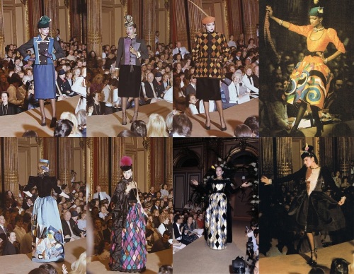
On July 25th, 1979, Yves Saint Laurent presented his Haute Couture collection for Fall/Winter 1979-80 at the Ritz hotel in Paris, culminating in a standing ovation from the audience. He offered the collection as “an homage to Serge Diaghilev and to his collaboration with Picasso”.

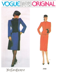
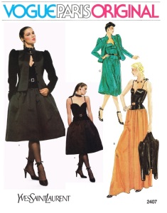
Later that same year, Vogue Patterns had drawn three looks from Saint Laurent’s Diaghilev/Picasso collection and delivered them in the form of three patterns: 2406, 2407 and 2408.

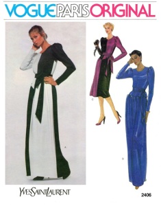
2406 - Front Envelope

2408 - Front Envelope2407 - Front Envelope

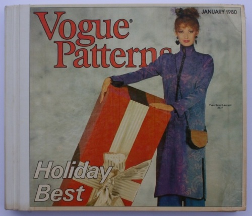
These patterns were first introduced to North American customers in the January 1980 counter catalog, just in time for the Fall/Winter 1979-80 Holiday season (which I believe would have actually been available in-store for December 1979, however England, and possibly other countries, had to wait one more month for the February 1980 catalog to reach stores).

Vogue Patterns  Catalogue, North America, January 1980.

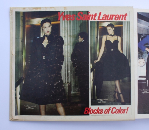
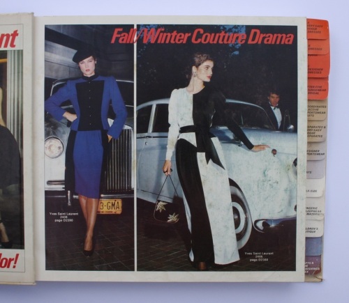
The catalog offered ‘Blocks of Color!’ and ‘Couture Drama’ by way of Yves Saint Laurent.

Inside Front Cover, Page 1 - Vogue Patterns January 1980 Catalogue.Inside Front Cover, Page 2 - Vogue Patterns January 1980 Catalogue.

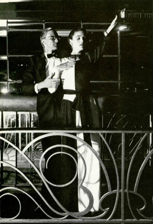
Just inside the front cover of the catalog, the Yves Saint Laurent originals are shown photographed on models Clotilde and Eva Voorhees, two top models of the period (Clotilde can also be seen on the pattern envelopes for 2407 & 2408. She was a Saint Laurent favorite for the runway and she even appeared in a television advertisement for the perfume ‘Rive Gauche’ in 1980). According to the ‘Guide for Fabrics and Accessories’ toward the end of the catalog, 2407 is shown with Yves Saint Laurent shoes, and 2406 with Yves Saint Laurent shoes and handbag.

The photographs evoke the excitement of heading out for a night in style to dinner, a fabulous party, or formal occasion. As long as you were quick getting the pattern and then even quicker at sewing, or getting someone else to make up your pattern, you could have been seen wearing the same style in the same season as one of Saint Laurent’s Haute Couture customers!

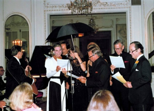
Nan Kempner at

Best-dressed American Nan Kempner wearing a Saint Laurent original.

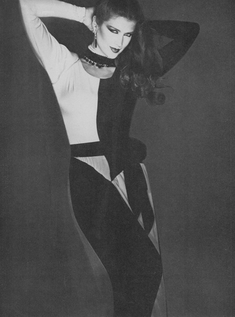
Nan Kempner, a woman considered to be one of the best-dressed American women of her time, wore the design that Vogue 2406 was based on. This gown was made from contrasting blocks of black and white silk satin-crepe.

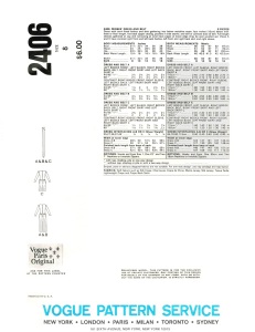
2406 - Front Envelope2406 - Back Envelope

This is a strikingly graphic design that seems to evoke the bold cubist elements of Picasso’s designs for the characters of the French Manager and the American Manager in the 1917 Ballet Russes production of ‘Parade’.

Picasso costume design for the Ballet Russes production of 'Parade', 1917.

Photograph of the ‘Manager français’ character from the original 1917 Ballet Russes production of ‘Parade’, with costumes and sets designed by Pablo Picasso.

Also, in one of Picasso’s sketchbooks from around 1916, as published in the book ‘Je Suis Cahier: The Sketchbooks of Picasso’ (edited by Arnold & Marc Glimcher), there are drawings of Harlequins and, although there was no Harlequin character in ‘Parade’, it is believed that these drawings reflect some of Picasso’s first ideas for the production of ‘Parade’. There can be seen a close resemblance of line between the Harlequin drawing below and the design lines of the dress from pattern 2406. Perhaps those sketches were of some inspiration for Saint Laurent?
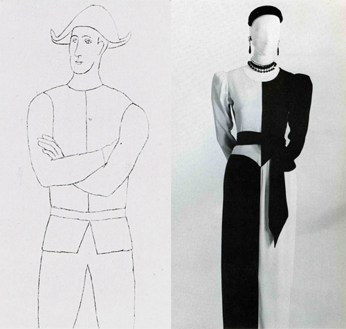
Picasso, Standing Harlequin, pencil on paper, 1916 & YSL's 'Picasso' gown, as exhibited at The Metropolitan Museum of Art, New York.

Drawing by Picasso of a standing Harlequin, pencil on paper, 1916, & YSL’s ‘Picasso’ gown, as exhibited at The Metropolitan Museum of Art, New York.

The black and white ‘Picasso’ gown was photographed for Vogue Paris’ September 1979 issue and, as pictured below, for L’Officiel’s fall couture collections issue, No. 655, 1979.
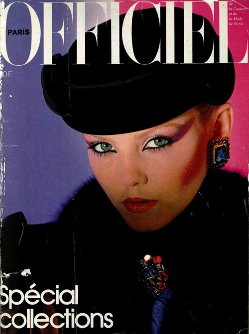
Front Cover of L'Officiel No. 655, 1979.

Front Cover of L’Officiel No. 655, 1979, ‘Special Collections’ for Fall. Model wears Yves Saint Laurent.

L’Officiel de la Couture et de la Mode No 655, 1979.

As seen in L’Officiel de la Couture et de la Mode No 655, 1979.

The editorial shot below shows model Clotilde (once again) wearing the black and white ‘Picasso’ gown (I am unsure of the publication that the image originated from). Thanks to Supermodelicons.com for this image.

Clotilde in YSL.

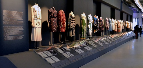
The black and white gown has also been included as an exhibit in many of the retrospective exhibitions for the fashion career of Yves Saint Laurent, the first being the 1983 exhibition ‘Yves Saint Laurent’ at the Metropolitan Museum of Art, New York, conceived and organized by Diana Vreeland – the very first of its kind at the Met dedicated to the work of one living designer. Others were the exhibitions ‘Yves Saint Laurent Style’ at the Montreal Museum of Fine Arts in 2008 and the de Young Fine Arts Museum of San Francisco in 2008/2009, and the exhibition ‘Nan Kempner, American Chic’, at the Met in New York in 2006/2007.
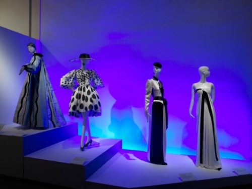
Exhibition 'Yves Saint Laurent Style' at the de Young Fine Arts Museum of San Francisco, 2008-2009.

Installation from the exhibition ‘Yves Saint Laurent Style’ at the de Young Fine Arts Museum of San Francisco, November 1 2008 – March 1 2009.
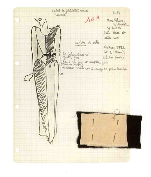
Photograph of an Yves Saint Laurent original illustration w. Silk Satin-Crepe Fabric Swatches

Photograph of an Yves Saint Laurent original illustration with silk satin-crepe fabric swatches, from the exhibition catalog ‘Yves Saint Laurent Style’, 2008.
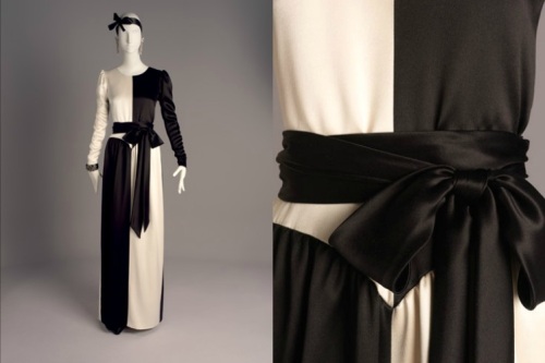
Yves Saint Laurent  Black & White Silk Satin-Crepe Evening Gown, AW 1979-80.

As seen in the exhibition ‘Nan Kempner, American Chic’ at The Metropolitan Museum of Art, New York, December 12, 2006–March 4, 2007.

On to Vogue pattern 2408: a suit of skirt and jacket that features contrasting blocks of black and royal blue.

2408 - Front Envelope2408 - Back Envelope

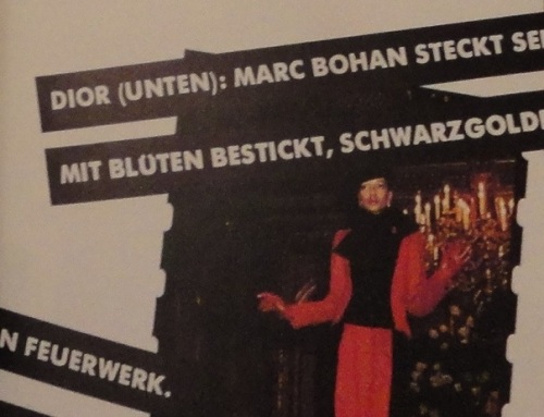
An almost identical suit to that of 2408 was also shown in the same collection, only it consisted of blocks of red and black, as seen below in a runway photo published in the October 1979 issue of German Vogue (modeled by Saint Laurent muse, Mounia).

Clipping from German Vogue, October 1979.

In the New York Times article ‘Diaghilev Inspires Saint Laurent’ published July 26, 1979, Bernadine Morris wrote:

“What is likely to hit the copyists’ market first are the two-fabric or two-color suits, which are not too subtle to be easily understood. A ribbed white wool jacket with black velvet collar and lapels is paired with a white skirt with velvet side panels. very slimming, those side panels.”

It is interesting that Bernadette mentions the two-fabric and two-color  combinations, as this is what Vogue Patterns selected from the collection – and for logical reasons. Usually the only means for most home sewers to recreate a designer outfit from a sewing pattern was through fabric and with trim, such as piping and purchased braid. Therefore, any designer looks that would involve highly skilled applications such as intricate embroidery/beading or applique wouldn’t have been commercially viable for a pattern company’s concern.

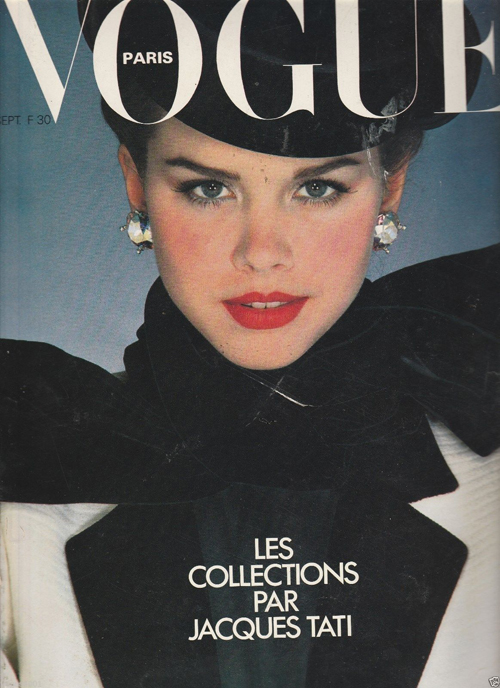
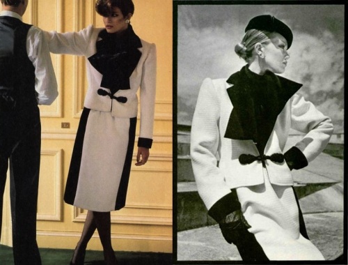
Also, Bernadette Morris mentions a white and black suit with “slimming” side panels to the skirt – these panels were repeated on the skirts of the blue/black suit of pattern 2408 and the red/black suit, pictured above. The white and black suit with velvet collar and lapels made the cover of Vogue Paris and was photographed for U.S. Vogue and for L’Officiel magazine.

Vogue Paris, September 1979.

Vogue Paris, September 1979.

U.S. Vogue, September 1979 & L'Officiel No. 655, 1979.

As seen in U.S. Vogue, September 1979 (Left) and L’Officiel No. 655, 1979 (Right).

Finally, there is pattern 2407: a romantic ensemble of full-skirted cocktail dress and jacket with the silhouette that was most dominant for evening in the collection – a full skirt of either below-knee or evening length, gathered in at the hip. The upper body for most evening looks was fitted and, if with sleeves, topped with a ‘puffed’ sleeve head. The contrasting blocks of this ensemble are more tonal by way of the luxurious textures of black velvet and black satin. The full skirt is reminiscent of the ballet tutu, and the corselet-style top and satin sandals with criss-crossed satin ribbons evoke the romance of the ballet.

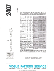
2407 - Front Envelope2407 - Back Envelope

Below you will see some examples of other dresses from the collection that share similar elements to that of 2407, whether it be the shape of the full skirt or the shape of the bodice.
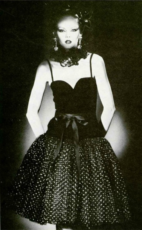
L’Officiel de la Couture et de la Mode No 655, 1979, B.

As seen in L’Officiel de la Couture et de la Mode No 655, 1979, this dress has a similar bodice and skirt shape to that of Vogue pattern 2407, however this dress has a skirt of glittering tulle that is suggestive of a tutu.
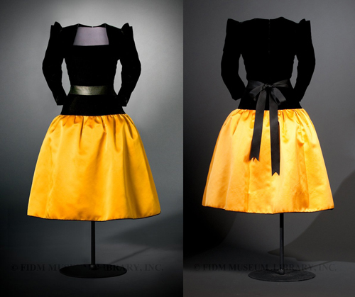
Yves Saint Laurent Black & Yellow Evening Gown of Silk Velvet and Silk Satin, AW 1979-80.

Yves Saint Laurent evening dress of black silk velvet and yellow silk satin, AW 1979-80. This dress was owned by Betsy Bloomindale and was donated to the FIDM in Los Angeles (Image will link to the FIDM’s blog article about the dress).

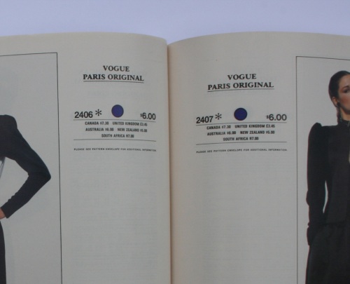
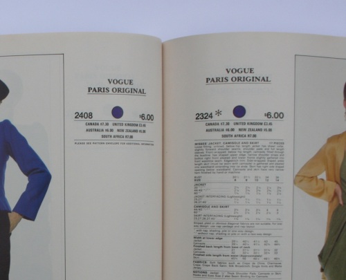
Interestingly, the three patterns 2406, 2407 and 2408 were not promoted in any issue of Vogue Patterns magazine (as most new designer patterns would have been) or, as far as I know, in any Vogue Patterns News flyer. Also, unusually, the pattern details and yardage requirements were not available in the counter catalog for these patterns and in their place the consumer was advised to ‘Please see pattern envelope for additional information’. Another point of interest is the ‘Vogue Customized Collection’, where an asterix next to the pattern number inside the catalog indicated that the pattern had to be specially ordered from those stores that had this label affixed to the front cover of their Vogue Patterns catalogs. This would most likely have been a policy for smaller or independent pattern retailers who wouldn’t have carried the full range of patterns. Directly below is an image taken from ebay of a copy of the January 1980 catalog with the ‘Customized Vogue Collection’ label affixed to the front cover.
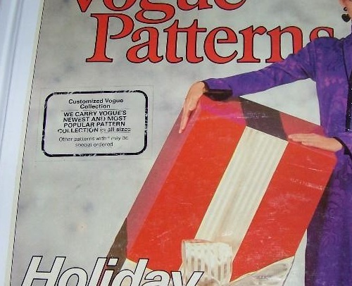
'Customized Vogue Collection', Vogue Patterns Catalogue, January 1980.

This copy of the Vogue Patterns January 1980 catalog had a label affixed to the front cover stating “Customized Vogue Collection – WE CARRY VOGUE’S NEWEST AND MOST POPULAR PATTERN COLLECTION in all sizes – Other patterns with * may be special ordered”. This included Vogue 2406 and 2407.

2406 & 2407 - Pattern details unavailable.

Patterns 2406 & 2407: “PLEASE SEE PATTERN ENVELOPE FOR ADDITIONAL INFORMATION”.

2408 - Pattern details unavailable.

Again, for pattern 2408: “PLEASE SEE PATTERN ENVELOPE FOR ADDITIONAL INFORMATION”.

It is also interesting that the patterns were made available within the same season as the collection from which the designs were taken – usually patterns would be released the following season.

I must say that these patterns are some of my favorites – it is for the beauty of the designs and for the glamour associated with Haute Couture, and it is because the designs originated from such a special collection from one of the world’s most brilliant designers. What a treat that these patterns were ever produced!

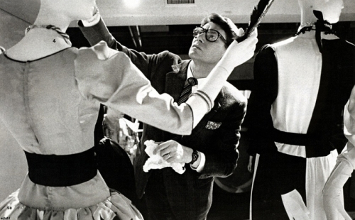
To end the post, below is a photograph of Yves Saint Laurent himself inspecting a display of two of his ‘Picasso’ dresses, most likely photographed sometime in the early to mid 1980s. The black and white ‘Picasso’ dress of Vogue pattern 2406 can be seen on the right.

Yves Saint Laurent, circa 1980s.

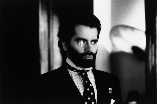
Karl Lagerfeld Pour Chloé.

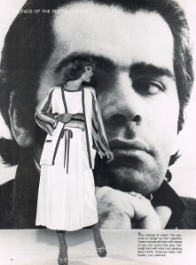
Karl circa 1975, photograph by Helmut-Newton.

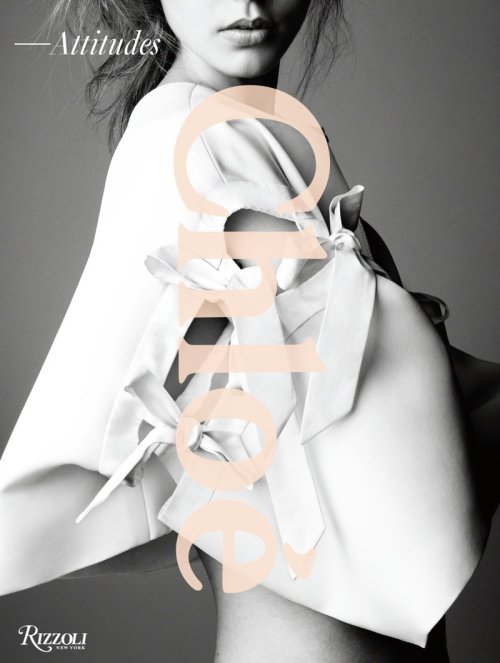
I’ve long been aware of Lagerfeld’s involvement as a designer with the Chloé label, and due to my pattern collecting I had become acquainted with those of his designs that were licensed to Vogue Patterns beginning in 1975. So I recently purchased the book ‘Chloé – Attitudes’ (released October 2013) in the hope of learning more about this period of the label’s history.

Click for a preview of Chloé - Attitudes at Amazon.com.

Click for a preview of Chloé – Attitudes at Amazon.com.

Usually I check out the latest books at two of my favourite book stores for art and fashion books in Sydney (Australia) when I go on a fabric-buying trip for myself to see if any books are worth buying. These trips don’t occur often as I live about four hours drive away from Sydney, but I have to travel that far as it is near impossible to find good fashion and art books and good fabric in rural Australia. I haven’t been to Sydney since early 2013 so I didn’t get a chance to check out ‘Chloé – Attitudes’ before making the purchase online (Occasionally I will buy a book from a bookstore but usually it’s much cheaper to buy online from overseas, and that’s including shipping! The prices of most imports in Australia are notoriously expensive compared to the rest of the world, and that’s with low or no tariffs in the name of free-trade!)

Anyhow, I took a chance and bought the book and was so excited when it arrived in the mail. I think my expectations were a little high as I was disappointed with, what seemed to be, a lack of content. On second and third viewings I came to value the book a little more, but I still feel that there could have been less empty white space and more pictures of the clothes and a little more detail in the text. Still, it would be impossible to cram sixty years of collections into one 273 page book.
The book vaguely captures the spirit of each period of the label’s history, beginning with the creation of the label by founder Gaby Aghion in the early 1950s (approximately 1952-1953) through to Karl Lagerfeld’s twenty year tenure from 1964 to 1984, and then following periods designed by several head designers up to 2013 (including Lagerfeld’s return from 1992 to 1997 which was practically glossed over and paid no attention).

Anyhow, back to Karl.

Lagerfeld came to Chloé with couture credentials after previously working with Pierre Balmain and at the house of Patou (see my previous post here) when he was hired as a designer for Chloé.  When he started, he was part of a team of freelance stylistes (as Prêt-à-Porter designers were often called in those days to distinguish them from Couturiers) who collaborated to design two collections a year. However, although the collections were designed by a team, Lagerfeld’s individual designs were recognised by the press as early as 1965 when the first credit of “Karl Lagerfeld pour Chloé” appeared in Vogue Paris. Eventually, Lagerfeld became the sole designer to work with Gaby Aghion in the studio after the last of the other remaining designers left in 1972. He remained so until he left in 1984 to work for the house of Chanel.

In my opinion, Lagerfeld’s designs for Chloé could at once be fun, chic, sophisticated and novel. I have most of the Chloé patterns from the Lagerfeld era in my collection.

Vogue Patterns released its first Chloé patterns in 1975, which were selected from the Spring/Summer 1975 collection – a time when Lagerfeld was making soft ‘unconstructed’ clothes that were made from beautiful fabrics (as was always the case with the Chloé label) but without the structure of interfacings and interior finishes (such as linings) that would typically be found in Haute Couture garments. One finishing technique utilized at that time was a zig-zag stitch used on the fold of hems and garment edges or, in the case of leather and suede, raw edges instead of traditional hems and finishing techniques (this practice of the zig-zag stitch was also to be found on Sonia Rykiel’s garments from the same period).

Many of the earlier Chloé Vogue patterns featured this zig-zag stitch finishing technique (known as the ‘Original Chloe Finish’ or the ‘Designer’s Finish’) and this technique, along with the lightness and softness of the clothes, was noted in ‘Chloé – Attitudes’:

‘On October 22, 1974, a shocked and thrilled Women’s Wear Daily splashed front-page news that the Chloé collection for spring 1975 had:

Rocked the fashion professionals…. Karl Lagerfeld’s 200 trendsetting models do for unconstructed shapes what Balenciaga once did for constructed clothes…. he ties his delicate crepe blouses and shirts together with a soft scarf belt. He knots material together, lets the woman create the shape for these scarf dresse. He does filmy dresses in multiple layers…. he leaves everything unhemmedfinished with a simple overstitch. His big accessory is a scarf, appearing as a choker, a belt, an ankle-wrap.
‘The press raved about the lightness of lagerfeld’s techniques. Hebe Dorsey, doyenne of the International Herald Tribune, used superlatives:

Lagerfeld’s biggest talent lies in his unconstructed approach to fashion which rests on a deep understanding of fabric. With a minimum of seams, it looks as if his clothes have been put together by sheer magic. As of last season, he developed a new way of finishing his hems, which are cut clean instead of doubled over. There is not the slightest trace of lining…. Some dresses are nothing but a couple of rectangles, the front one folded over the back one…. as a result, everything floats.

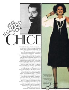
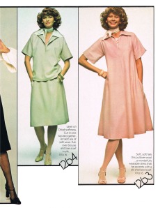
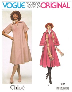
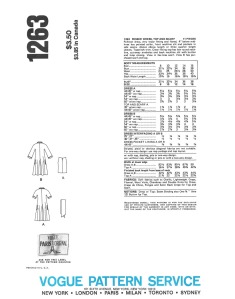
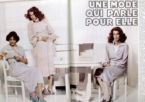
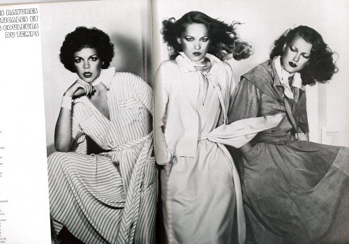
Below is the two-page spread introducing ‘Karl Lagerfeld for Chloé’ from the July/August (or Early Autumn) 1975 issue of Vogue Patterns magazine with designs taken from Chloé’s Spring/Summer 1975 collection and, further down, views of the front and back envelope for Vogue pattern 1263. 1263 and 1264 have been accessorized with one of the essential Chloé accessories of the season – the scarf choker.

Vogue Patterns, July/August 1975 a  Vogue Patterns, July/August 1975 b

1263  1263, Back Envelope.

Below is an editorial spread from Vogue Paris, February 1975, and a page from American Vogue, February 1975, both showing clothes from Chloé’s Spring/Summer 1975 collection:

Vogue Paris, February 1975.

Vogue Paris, February 1975.
(Image from: http://www.ciaovogue.com)

Vogue Paris, February 1975.

Vogue Paris, February 1975.
(Image from: http://www.ciaovogue.com)

American Vogue, February 1975.

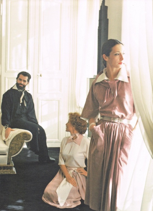
As shown in ‘Chloé – Attitudes’, this image is from a story shot by Deborah Turbeville at Karl Lagefeld’s home for American Vogue, February 1975. It was captioned:
‘The essence of modern dressing – unstructured, weightless, totally feminine…
Karl Lagerfeld says, “The basic idea is the simplest of all – a blouse and skirt. One must look twice to discover les raffinements de luxe.” Worn here in Karl’s apartment by Marie-France Acquaviva, his “right hand”, and French actress Stephane Audran. Stephan Audran, left, in one of Karl’s ravishing two-piece crepe de chines – the palest boise de rose blouse, two-tone sash, pleated skirt. Marie-France Acquaviva in the thinnest of thin suedes – without hems, without double stitching “suede that becomes skin again.”‘

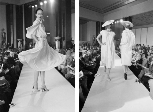
Below, several photograph’s from the runway of Chloé’s Spring/Summer 1975 fashion show:

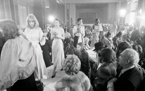
Spring-Summer 1975 Fashion Show (a)

Spring-Summer 1975 Fashion Show (b)

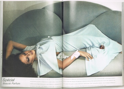
Below is a two-page spread taken from the Beauty section of Vogue Paris, May 1975. This spread announces the recent release of the first Chloé fragrance. The model is wearing a dress and scarf (tied around the wrist) from the Spring/Summer collection. Perhaps it is not just coincidence that Chloé singed a licencing deal for a perfume with Elizabeth Arden in 1975 and began licencing its designs to Vogue patterns the very same year… In the book The Beautiful Fall, by Alicia Drake, it is written:

          In early 1975 Chloé and Karl Lagerfeld signed a lucrative perfume deal with Elizabeth Arden in the US to create the first Chloé fragrance. It was a crucial moment for Karl. For it is with this contract and the media profile and cash it generated that, for the first time in his career, Karl moved beyond being the hired hand at Chloé to receiving some of the profit share…

          Significantly, Aghion (Gaby) and Lenoir (Jacques, Aghion’s husband and business partner) chose not to give him shares in the actual company of Chloé, but instead formed a new company with Karl called Karl Lagerfeld Productions, dividing the share count three ways, with 50 shares for Karl, 25 for Gaby Aghion and 25 for Jacques Lenoir. ‘It was supposed to be a company for licences,’ says Gaby Aghion, ‘for the perfumes and for the Karl Lagerfeld line which was launched in Japan only, not in Europe.’ That meant Karl’s profit share was on everything except the Chloé ready-to-wear.

Perhaps that included the revenue from the Vogue Patterns licence? And perhaps the Vogue Patterns deal was a sign of the company reaching out for a multitude of licencing opportunities, as had become the trend for large fashion companies at that time.

Vogue Paris, May 1975.

The organic rounded lines of the Chloé perfume bottle mimic the softness of the clothes from the collection.

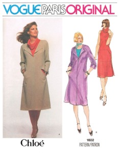
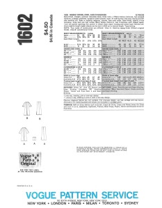
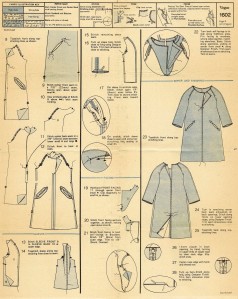
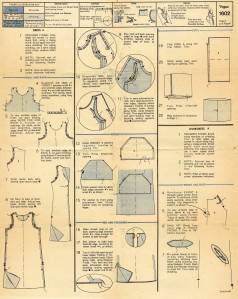
Below is Vogue Pattern 1602 (with Lisa Taylor modelling on the front envelope). I’m not sure of the date for this pattern, but it is probably around 1976. I have included this pattern in this post especially to demonstrate the zig-zag-stitch finishing technique (or the ‘Original Chloé Finish’ or the ‘Designer’s Finish’) that was being used for the Chloé collections of the time. You will the find two pages of the instructions from 1602 that show the method of construction utilizing the zig-zag finish. It is used on everything except the separate detached cowl (which I think is really neat-o! Along with the slits in the outer-dress to access the corresponding pockets of the under-dress!)

Just so you know… 1602 also comes with instructions (and pattern pieces of facings) to construct the garments with traditional facings and hems.

1602  1602, Back Envelope.

Instructions for 1602 - Page 3Instructions for 1602 - Page 2

FALL/WINTER 1975/76:

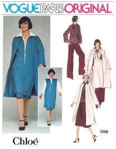
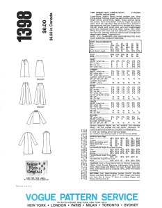
Below is Vogue pattern 1398, of which the design of the garments is similar to those of the Spring/Summer 1975 collection. I think this pattern was released some time in early 1976, along with Vogue pattern 1398 (also below). The envelope photos for both patterns seem to have been photographed in either the same photo shoot or around the same time as the model’s (Angeleen) hair style is the same for both and the blue hue of the clothes is similar.

1398  1398, Back Envelope.

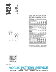
1424  1424, Back Envelope.

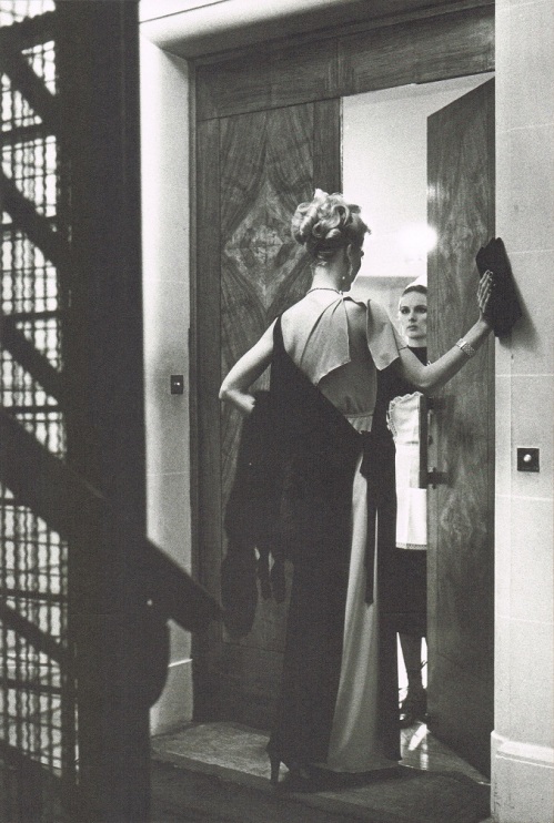
Below is a photo by Helmut Newton which appeared in the December 1975 issue of Vogue Paris. I believe that the dress shown is the same design as Vogue pattern 1424 (above) except that the two separate overlapping wrap components of the dress below have been made from two contrasting colors. Therefore I believe that the dress design of 1424 and the designs from 1398 are from the Fall/Winter collection of 1975/76.

Vogue Paris, December 1975.

Also from ‘Chloé – Attitudes’, this photo was published in Vogue Paris, December 1975, and photographed by Helmut Newton. It was captioned:
“Long double crepe wraparound dress. One half of the dress is nude and the other half is black with identical décolleté at the front and back”.
This dress appears to be the same design as that of Vogue pattern 1424, only the two overlapping components of the dress are made from contrasting colors. This contrast two-tone effect could easily be replicated by the home sewer with pattern 1424 if desired.

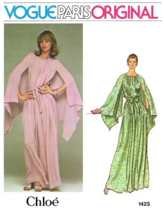
Below is Vogue pattern 1423. I suspect it comes from the same collection (Fall/Winter 1975/76) as 1424. Consecutive pattern numbers (1423 & 1424) usually indicate that patterns were released at the same time. The zig-zag finish is also utilized with this design. The cape-like handkerchief sleeves are so dramatic and really make this design special.

1423  1423, Back Envelope.

SPRING/SUMMER 1977:

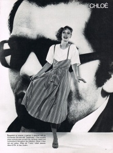
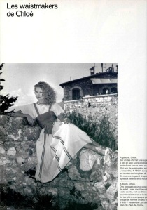
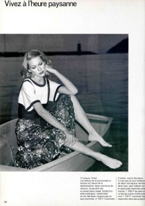
Below are editorial images in which a set of three Chloé patterns appeared in Vogue Patterns magazine for March/April 1977. All three patterns feature a wrapped waist, or ‘waist-maker’ in the form of wrap-around vests or an attachment that doubles as a shawl. Also, further down, are editorial images from the French and American issues of L’Officiel magazine showing variations of Chloé garments with the wrapped-waist, and emphasizing the  ‘waist-maker’ as an important look for the Spring/Summer 1977 season.

Vogue Patterns, March-April 1977 a

Vogue Patterns, March-April 1977 bVogue Patterns, March/April 1977 c

L'OFFICIEL USA Spring Collections Issue 1977, Volume II, No. 2 (a)L'OFFICIEL USA Spring Collections Issue 1977, Volume II, No. 2 (b)

L'OFFICIEL DE LA MODE no 629 de 1977 (a)L'OFFICIEL DE LA MODE no629 de 1977 (b)

L'OFFICIEL DE LA MODE no629 de 1977 (c)L'OFFICIEL DE LA MODE no629 de 1977 (d)

SPRING/SUMMER 1979:

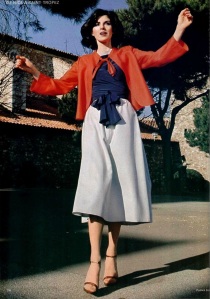
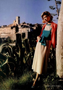
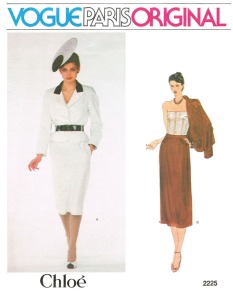
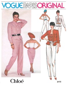
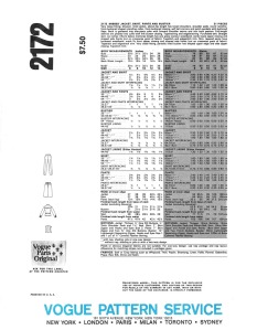
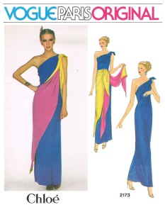
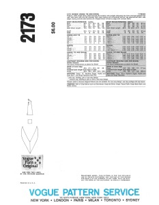
Below are three of my most favorite Chloé patterns and I believe the designs to be from from the Spring/Summer 1979 collection. Vogue 2172 and 2173 can be found in the May/June 1979 issue of Vogue Patterns magazine and 2225 in the July/August 1979 issue. In the editorial pages further down, similarities to the photographs on the front envelopes of 2225 and 2172 can be seen in the form of garment shapes and details, such as the bustier (a very important look in Paris for the season, according to L’Officiel USA, February 1979) and contrast collars, and accessories such as ‘cartwheel’ or ‘saucer’ hats.

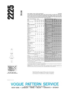
2225  2225, Back Envelope.

2172  2172, Back Envelope.

2173  2173, Back Envelope.

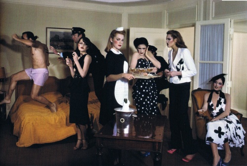
Vogue Paris, February 1979, Photogrpah by Guy Bourdin.

Vogue Paris, February 1979, Photogrpah by Guy Bourdin.

Vogue Paris, February 1979, Photogrpah by Guy Bourdin.

Vogue Paris, February 1979, Photogrpah by Guy Bourdin.

British Vogue, April 1979.

Gia Carangi models in these two images from a spread that appeared in British Vogue, April 1979. How exciting are the colors, textures and shapes of these clothes and accessories? I love those lacquered straw ‘cartwheel’ hats, they’re very glamorous!
(Images from: http://devorahmacdonald.blogspot.com.au)

FALL/WINTER 1979:

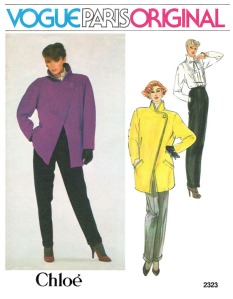
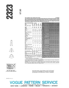
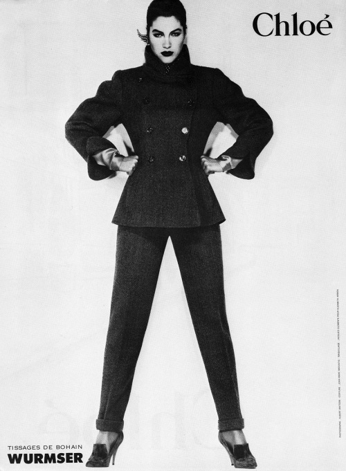
I found this pattern, Vogue 2323, really exciting when I first discovered its existence several years ago. The silhouette of the clothes combined with the model’s pose (Tara Shannon?) is so sharp, so dynamic. This pattern featured in the November/December 1979 issue of Vogue Patterns magazine so I believe it would be taken from Chloé’s Fall/Winter 1979/80 collection. Check out the Chloé ad campaign for the same season below (images from myvintagevogue.tumblr.com). The collar of the jacket in the first image correlates with the collar of the coat from pattern 2323, and the style of the pants is identical.

2323  2323, Back Envelope.

Chloe_1979_1

(All images for Fall/Winter 1979/80 ad campaign from myvintagevogue.tumblr.com)

Don’t you just love the hats and, especially, the satin spats?

Chloe_1979_2  Chloe_1979_4

Chloe_1979_3  Chloe_1979_5

FALL/WINTER 1981/82:

Here is the Chloé offering from Vogue Patterns for Fall of ’81. Culottes seem to have been a big trend in the early ’80s, there were many designer patterns made available featuring culottes. This pattern, Vogue 2855, from Chloé has an interesting buttoned-down band detail on each leg, continuing down on the left from the asymmetric front opening of the blouse, also with asymmetric collar. I agree with Vogue Patterns‘ statement below of the ‘Artful Handling’ of the sometimes difficult-to-wear culottes. I like this pattern very much. I like the design, I like the styling and the accessories in the photo, and I like Terri May! (the lovely model).

This pattern, curiously, has at sometime been mislabeled in its production as being designed by Claude Montana (visit Vintage Pattern Wikia to see) but can also be found printed with the Chloé’ label on the envelope. Both versions were numbered as 2855.

I know of one other instance where a pattern has been printed with one of two different designer labels. Visit BCN-Unique Designer Patterns to take a look.

Vogue Patterns, November/December 1981.

Vogue pattern 2855, as seen in Vogue Patterns magazine, November/December 1981.

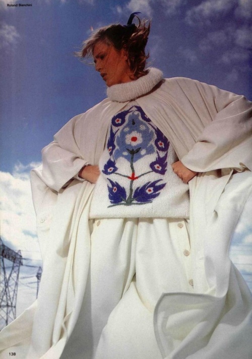
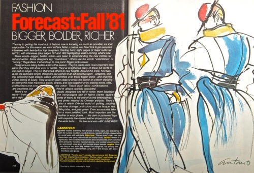
Below is a page taken from the french edition of L’Officiel (L’OFFICIEL DE LA MODE no676 de 1981). Notice the culottes? The cape and sweater are also by Chloé. The cape can also be seen in the illustration, further below, by Antonio that appeared in a 1981 issue of American Vogue. Also illustrated is a skirt with the same buttoned-down detail as the culottes, and a different bodice design with a variation of the buttoned-down front.

L'OFFICIEL DE LA MODE no676 de 1981.

All garments by Chloé.

Vogue, 1981.

Antonio’s illustrations of Karl Lagerfeld’s designs for Chloé, US Vogue, 1981.

In 1984, Lagerfeld’s long tenure at Chloé ended, having been approached by Chanel to reinvigorate the old house (although he was to return to Chloé for a briefer period from 1992 to 1997). Lagerfeld’s last collection at Chloé was for the Spring/Summer season of 1984, so any Vogue patterns by Chloé released in late 1984 or early 1985 onward would likely have been designed by the many new and constantly-changing designers brought in after Lagerfeld departed.

Gaby Aghion, who worked with Lagerfeld for all of his twenty years said of him:

“It was a very, very big pleasure to work with him for so long…. Karl is a very talented man. And I think what he did during his time at Chloe made a big contribution to fashion history”.

The book ‘Chloé – Attitudes’ was released in October last year (2013) as a result of the 60 year anniversary of the house and the first retrospective exhibition of the label ever to be held, which took place at the Palais de Tokyo, Paris, in October of 2012.

One view point of the exhibition 'Chloé - Attitudes' at the Palais de Tokyo, Paris.

One view point of the exhibition ‘Chloé – Attitudes’ at the Palais de Tokyo, Paris.

To commemorate the anniversary, in early 2013 the house also reissued 16 key pieces from its extensive history to create the commemorative ‘Edition Anniversaire’ collection, which was available to buy at Paris retailer Printemps.

So, how about making your own ‘Edition Anniversaire’ piece from a vintage Vogue Chloé pattern? To see more Chloé patterns visit the Vintage Pattern Wikia.

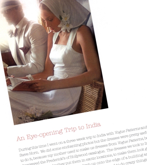
An Eye-Opening Trip to India.

From 'Jerry Hall - My Life In Pictures'.

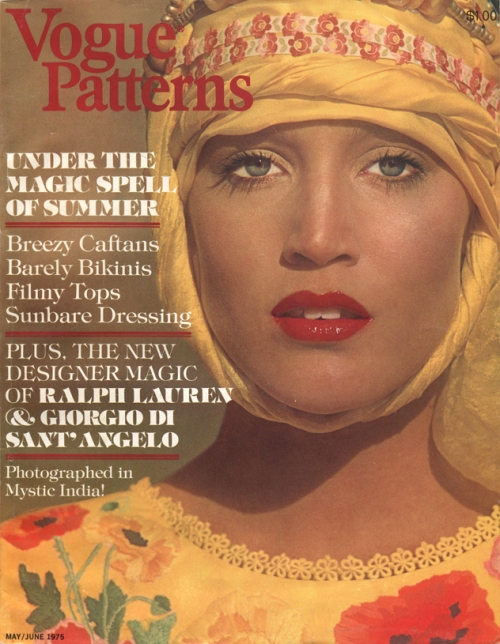
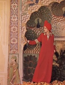
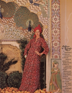
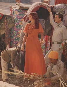
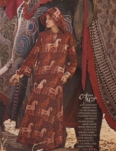
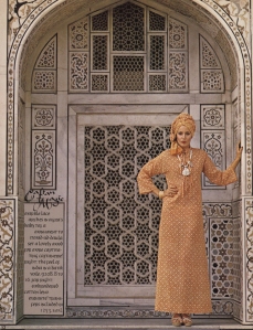
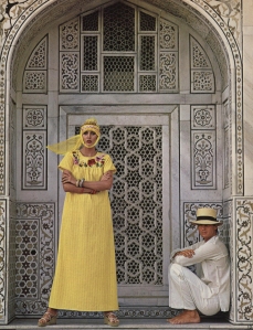
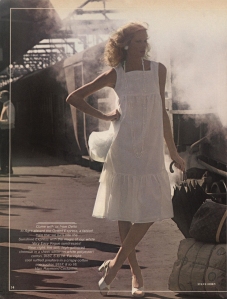
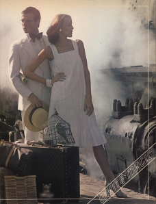
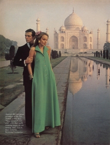
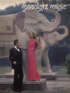
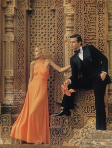
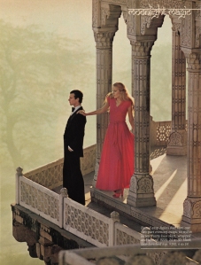
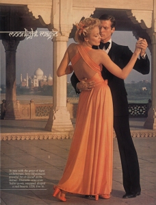
Everyone’s already seen the spread of Jerry Hall in India from the May/June 1975 issue of Vogue Patterns magazine, right? Maybe not, but even if you have I’ve got an interesting piece of info here that you may not have seen before.

So before I show you the pages from the magazine I thought I would share this amusing excerpt from Jerry Hall’s book ‘My Life In Pictures’, published in 2010, where Jerry shares her memory of that trip to India during the early years of her modelling career. It’s amusing because the photo-shoot portrays a romantic view of India, whereas Jerry recounts some of the realities. Here it is:

“During this time I went on a three-week trip to India with Vogue Patterns and photographer Steve Horn. We did some enchanting photos but the dresses were pretty awful! I was happy to do it, because my mother used to make us dresses from Vogue patterns, before she discovered the Frederick’s of Hollywood catalogue. The dresses we took to India were very simple, which is why they put them in exotic locations, to make them look glamorous.

For one shot, Steve made me climb up onto the edge of a building and hang on. I really could have killed myself – we sometimes had to do crazy things while modelling.

We travelled around India by train and I remember breakfast was made by a guy wearing what looked like a rag diaper, squatting down scrambling eggs over a little fire. Those Indian trains were pretty primitive. We took about 30 trunks of clothes and had porters to carry them around. Everywhere we went we saw examples of extreme poverty. I’d never seen anything like it and it was a shock.

It was in India that I took up yoga for the first time. I’ve done it ever since; I made a yogacise video back in the eighties. I also tried vegetarianism in India, but after three days spent meditating and having a strange out of body experience I knew it just wasn’t for me – I’m Texan and I need my steak.”

I guess that after a few years of modelling in Paris, naturally, Jerry couldn’t help but notice the difference between the dresses made from ‘Very easy, Very Vogue’ patterns and the Haute Couture and designer prêt-a-porter outfits she’d become familiar with.

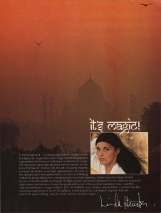
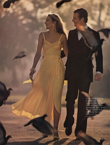
Below is the “Magic India” content from the magazine:

May June 1975 - Cover.

May June 1975 - Index.  May June 1975 - Editors Letter.

1  2

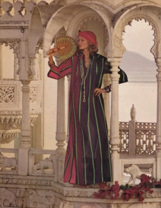
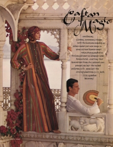
Below: ‘Caftan Magic’

Such beautiful backgrounds. The turbans and accessories also help to create the ‘magic’ of the caftans.

3  4

5  6

7  8

9  10

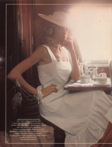
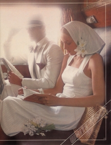
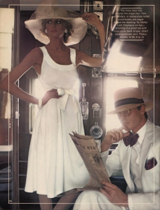
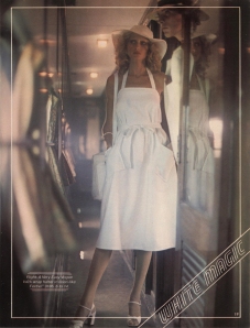
Below: ‘White Magic’

A romanticized and nostalgic take on train travel. No rag-diapers in frame, of course.

11  12

13  14

15  16

Below: ‘Moolight Magic’-

Evening ensembles with even more stunning background locations.

17  18

19  20

21  22

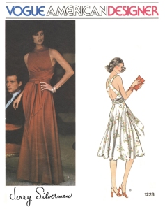
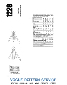
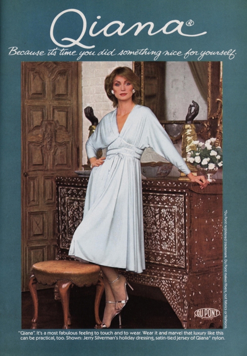
I wonder what Jerry thought about the one and only women’s designer pattern in the shoot, Vogue 1228 by Jerry Silverman (above, left). Probably just another dress, right? Anyhow, I’ve always liked that pattern, and the design is quite similar to a dress designed by Halston in 1972 (pictured below), except for a different front bodice, which came several years before the Jerry Silverman version. Vogue 1228 looks so good on the pattern envelope, and it’s likely to be the designer original that was photographed, which was usually, if not always, the case with designer patterns. The orange version photographed in India was made up from Qiana, a synthetic nylon jersey, and I suspect that the designer original was also made from Qiana because of an advertisement I found in an issue of L’Officiel from 1978 for Qiana featuring a dress by Jerry Silverman (see below). Also shown here is an ad from the same issue of Vogue Patterns magazine for Qiana with Vogue 1228 made-up from a soft pink color of the fabric.

1228  1228 Back Envelope.

Advertisement for Qiana featuring Vogue 1228 by Jerry Silverman.

An advertisement for Qiana, featuring a dress made from Vogue 1228 by Jerry Silverman with the nylon knit fabric. This ad was taken from the first few pages in the May/June 1975 issue of Vogue Patterns magazine.

An ad for Quiana with a dress by Jerry Silverman made from the nylon knit fabric, taken from L'Officiel USA, Holiday 1978, Volume III, No 7.

An ad for Qiana with a dress by Jerry Silverman made from the nylon knit fabric, taken from L’Officiel USA, Holiday 1978, Volume III, No 7.

Halston, 1972.

Halston’s design in silk jersey from 1972 preceeded the similar Jerry Silverman design by several years. That’s Karen Bjornson modelling on the right (Images taken from the book ‘Halston’ by Steven Bluttal, first edition from 2001 by Phaidon Press Ltd).

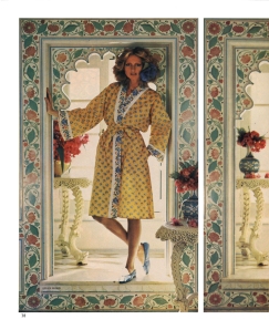
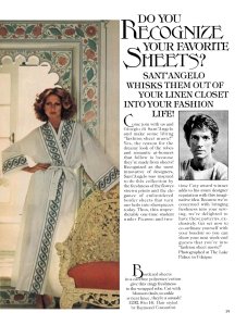
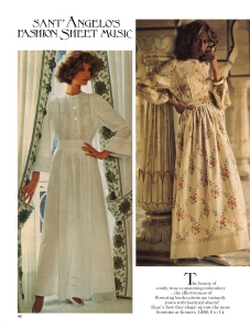
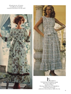
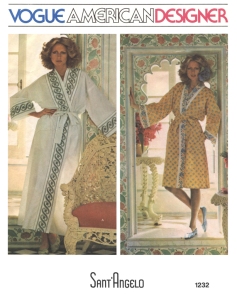
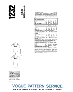
Below is the introduction of American designer Giorgio di Sant’Angelo to Vogue Patterns in Vogue Patterns magazine. The Sant’Angelo spread didn’t feature Jerry Hall but the other model from the India shoot (does anyone know her name?). The robes and two of the dresses were evidently photofraphed on the India shoot, but the other two dresses were photographed elsewhere with a different model. I love how the prints on the robes tie so beautifully with the colourful tiling in the background! I have the pattern for the robe in my collection and I hope to make it up some day as a gift for a friend or relative. I’ve been on the lookout for suitable fabrics when out fabric shopping (which isn’t often) and  I’ve been meaning to check-out the clearance bins at the local manchester shops for colourful and attractive flat-sheets to use, but I haven’t got round to it yet.

Sant Angelo Page 1  Sant Angelo Page 2

Sant Angelo Page 3  Sant Angelo Page 4

1232  1232 Back Envelope.

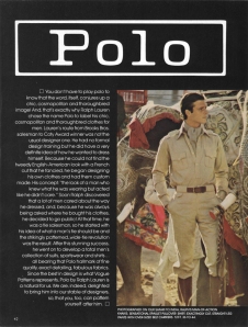
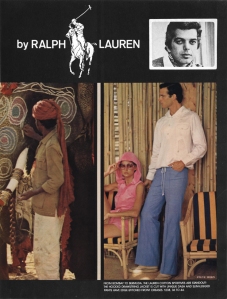
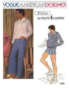
Here is another introduction of a designer in this issue of Vogue Patterns magazine, in this instance it is Polo Ralph Lauren for men! I get especially excited over designer patterns for men, as there weren’t that many ever produced compared to women’s. The seventies was the period when the most were produced, with designs by Bill Blass, Pierre Cardin, Givenchy, Dior, Saint Laurent, Valentino, Calvin Klein and Ralph Lauren.

Polo Ralph Lauren Page 1  Polo Ralph Lauren Page 2

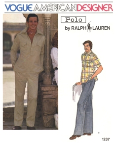
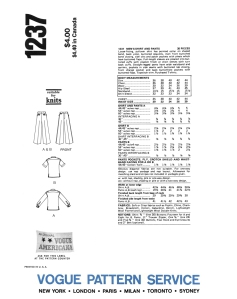
1237  1237 Back Envelope.

I like the oversized belt carriers on the pants of pattern 1237. You can see another good view of the outfit for this pattern in the ‘Caftan Magic’ spread.

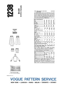
1238  1238 Back Envelope.

Anyhow, the India photo shoots make for a very special issue of Vogue Patterns magazine. There are some stunning photos here, and I’m not sure that any other location shoots by Vogue Patterns ever topped it.

Below is the front dust jacket of the book ‘Jerry Hall – My Life In Pictures’ by Quadrille Publishing Ltd, 2010 (ISBN: 978 184400 880 3). I obtained my second-hand copy very cheap on abebooks.com. It’s a very entertaining read with MANY fabulous images and is a more up-to-date and slightly more detailed version of Jerry’s ‘Tall Tales’ from 1985, which is also in my library (I love Jerry!).

'Jerry Hall - My Life In Pictures' Cover.

Robe de Mariée de Christian Dior: Autumn/ Winter 1979-80

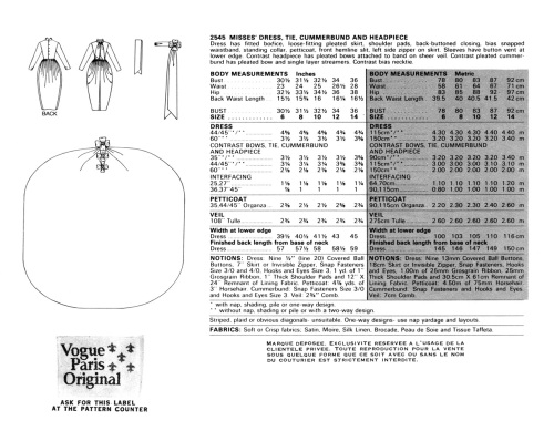
 2545

I’ve always thought of this Christian Dior pattern as extremely elegant, and I just love the shape of that skirt! This design was taken from the Christian Dior Haute Couture collection for Autumn/Winter 1979-80, designed by Marc Bohan, and that pegged balloon skirt was a major theme in the collection and was used for evening gowns and cocktail dresses as well as for the traditional climax of an Haute Couture show, the bridal ensemble, translated into pattern form as Vogue 2545.

2545 Back View

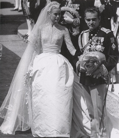
I can’t seem to find 2545 in any of my Vogue Patterns magazines from 1979 and 1980, so I can’t identify the exact time of release, but I’m guessing it must have been sometime in 1980. 2545 must have been a  popular pattern as it was still available for purchase in the April 1988 store catalogue, if not later than that. I can see why it would have been popular, it is so beautiful, so classic, and a refreshing alternative to the usual A-line or column silhouette of bridal gowns. It has always reminded me of the gown worn by Grace Kelly when she married Prince Rainier III of Monaco in 1956, hers was designed by Helen Rose, a costume designer from MGM studios. It shares a similar silhouette with the Dior of 1979, both have a slightly similar bell-shaped skirt with deep tucks at the waistline, both have a fitted bodice with long sleeves and a high neckline, and both have a cummerbund to finish the waist.

Grace Kelly and Prince Rainier III of Monaco on their wedding day, 1956.

Grace Kelly and Prince Rainier III of Monaco on their wedding day, 1956.

Below are some images of gowns from the same collection that feature the bell-shaped skirt.

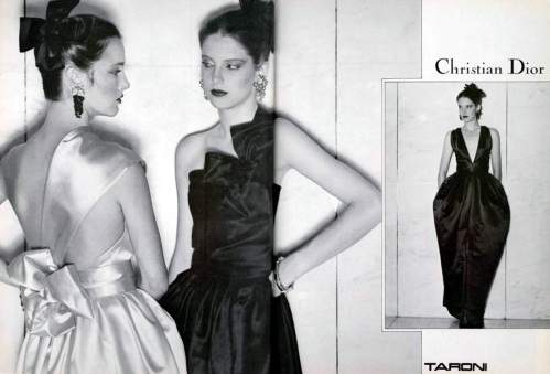
Advertisement: Dior, TARONI.

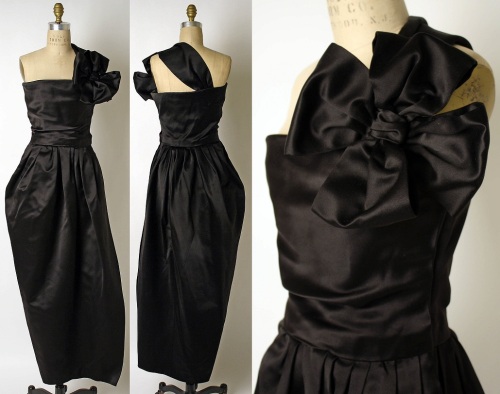
An advertisement for evening gowns from the Dior collection. Taroni was the supplier of the fabric. Notice how the two gowns on the left feature the same pleated-bow trim as 2545? The bow motif is also repeated as an accessory to be worn in the hair.

Three views of an evening gown by Dior.

Three views of the same evening gown featured in the print advertisement above. It is from the collection of the Costume Institute at the Metropolitan Museum of Art, New York.

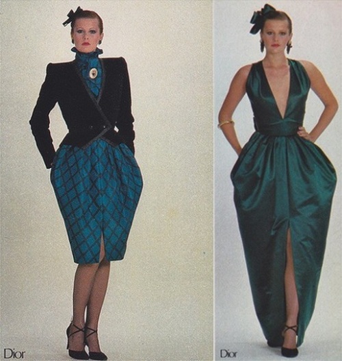
Two looks from the Christian Dior AW 1979-80 Haute Couture collection.

Two more looks from the collection. The evening gown on the right is also featured in the print advertisement above.

There is a video on youtube with brief clips of this Haute Couture collection by Dior and also of an Yves Saint Laurent collection from the same season, however I’m quite sure that the Saint Laurent collection is the Rive Gauche (prêt a porter) collection. The picture and sound quality isn’t great but the bridal gown of 2545 is easily recognisable, and also the gowns that precede it with the same shape of skirt can be seen. There’s a gorgeous lilac number in there, too. It’s interesting that both Dior and YSL show very similar trends for daywear in the form of plaid and tartan. I also love seeing the models doing their own make-up surrounded by the buzz of anticipation before the show!

Youtube clip of the Dior Autumn/Winter 1979-80 Haute Couture Collection.

Youtube clip of the Dior Autumn/Winter 1979-80 Haute Couture Collection. Terri May is modelling the bridal ensmble.(As in my Way Bandy post from last year, I apologize that I cannot embed videos into my blog posts, but click on the screen capture for a link to the youtube clip).

I’d be thrilled if someone asked me to make this dress for them for their special day. I would most likely soften the shoulder line by reducing the size of the shoulder pads, or for a wedding held during warmer weather I’d change the bodice to a strapless or sleeveles version  with a more open neckline. But really, the bodice could be adapted in almost any way as long as it was still close fitting, and the dress would still be amazing because it’s all about that fabulous skirt! I have a few copies of 2547 in my pattern collection, just waiting to be used some day…

Copies of 2547 can currently be found on eBay and etsy, including the etsy store ‘patternvault’.

UPDATE: June 14, 2013:

I recently acquired some Vogue Patterns magazines from 1981 and in the March/April issue I found Vogue 2457 included in a two-page bridal feature, along with an Emanuel Ungaro design. I’m not sure if this is the first intance of 2457 showing up in Vogue Patterns magazine, the only other issue could be the Septemner/October 1980 issue, which I don’t yet have in my library.

Here is the two-page spread (remember to right click and open in a new tab to see the larger version):

Brides In Vogue, Vogue Patterns, Page 72, March-April 1981.    Brides In Vogue, Vogue Patterns, Page 73, March-April 1981.

Way Bandy: Designing the Face of Vogue Patterns.

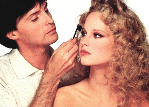
WAY BANDY with ROSIE VELA

Just recently I was flipping through some of my old issues of Vogue Patterns magazine from the 1970’s because I was hoping to find a certain pattern so that I could date it. My collection of Vogue Patterns magazine is far from complete so I didn’t find the pattern, but I did stumble upon an interesting article about the legendary make-up artist Way Bandy. I had read the article almost two years ago when I first received the magazine (an eBay purchase) but this time around I was more aware of who Bandy was and the impact he made on the fashion world of his time.

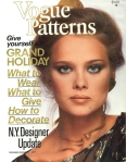
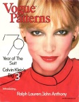
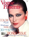
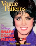
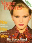
Bandy made-up the faces of many famous personalities and of the very best models for the best magazines. He was also hired by Vogue Patterns in the late 1970’s to do the faces for the covers of at least six issues which I have in my collection, one from 1977, one from 1978, and four from 1979.

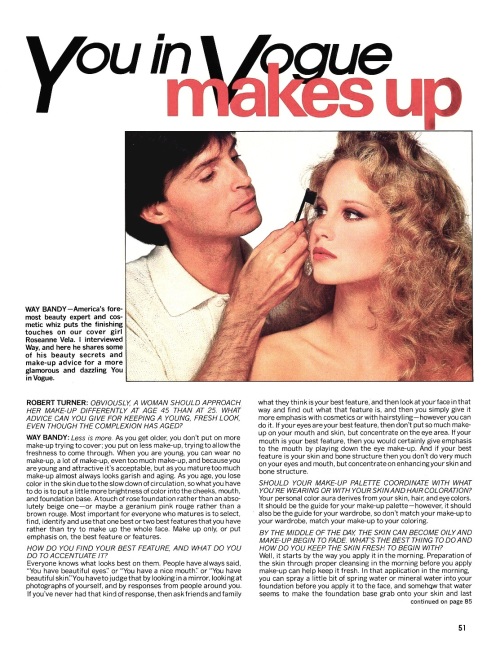
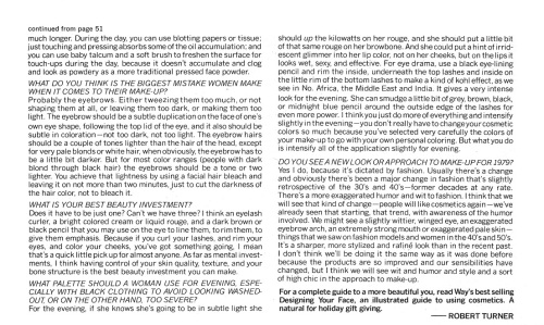
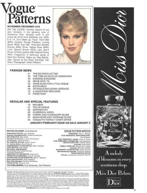
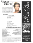
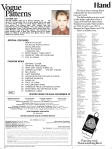
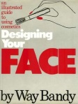
In the November/December 1978 issue there is an article featuring an interview of Bandy by then senior fashion editor, Robert Turner. The article is really an advertisement for Way Bandy’s first-published book ‘Designing Your Face: An Illustrated Guide to Cosmetics’ (1977), however it does still give away some useful tips and advice to readers as a taste of what the book has to offer. The article (and the cover shot and index page of the issue it is from) is below:

WAY BANDY INTERVIEW PAGE 1NOV DEC 1978

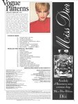
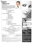
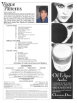
Below: The covers and index pages of the other five issues with make-up by Way Bandy.

NOV DEC 1977   

MAR APR 1979   


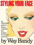
Bandy also released another book in 1981 titled ‘Styling Your Face : An Illustrated Guide to Fifteen Cosmetic Face Designs for Women and Men’ (I wonder what he recommends for the guys? Very unusual). Both books can be purchased in used condition for a very reasonable price from abebooks.com (click on the images below for a direct link).


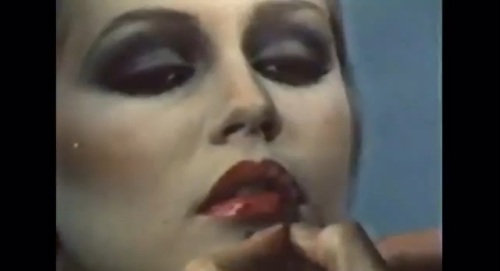
Below: Here is a special treat. It is a video clip of Way Bandy making-up a face and it’s from the HBO documentary ‘Beautiful Baby, Beautiful’ from 1980. I think it’s very exciting to watch and, in my opinion, it all looks great until the hair comes down! (I’m sorry that I’m unable to embed the clip, but the image links directly to the YouTube site).

I recommend watching the full documentary on YouTube, it’s fantastic!

I think it’s also interesting to note that Vogue Patterns had an advertising deal with Christian Dior cosmetics, with advertisements for Dior cosmetics and the ‘Miss Dior’ perfume appearing on the pages of most, if not all, of these issues, including a full-page back cover ad for ‘Miss Dior’ on the Nov/Dec 1978 issue. Dior cosmetics were used on each cover of Vogue Patterns magazine from some point in 1977 up until at least 1989, including all six issues mentioned here.